Keysnap
Keysnap, formerly known as SaveHours, is an early-stage B2B and B2C SaaS platform that automates financial spreading and analysis reporting by extracting key financial information from borrowers’ financial statements. By eliminating manual data entry and streamlining financial workflows, Keysnap helps analysts, underwriters, and consumers manage borrower data more efficiently.
Fresh off a round of seed funding and armed with an impressive minimum viable product (MVP), Keysnap came to Tiller for help with branding the startup and launching it into a niche market.
Category
Financial Analysis Automation Software
Services Provided
- Naming
- Value Proposition
- Brand Identity
- Full-Service Web
Objectives
- Rename SaveHours to a more modern, evocative name that gives context to its value
- Craft a unique and memorable brand identity to support the new name
- Develop a compelling value proposition to inform web and sales copy
- Apply the new brand to a splash page to grow brand awareness and attract banking partners
- Succinctly capture Keysnap’s functionality on the splash page with value-driven messaging
- Strategically promote Keysnap’s free trial offering and pricing matrix on the splash page to increase sign-up rates
- Equip the Keysnap team with comprehensive brand guidelines to ensure consistency across all channels
Challenge
With an MVP and limited branding, SaveHours needed a compelling brand identity to take the platform to market.
The first point of attack? They needed a stronger brand name. “SaveHours” lacked personality and was far too generic to stand out in a niche financial market. They came to Tiller looking for a more memorable and meaningful name that would support the brand’s positioning more metaphorically than literally.
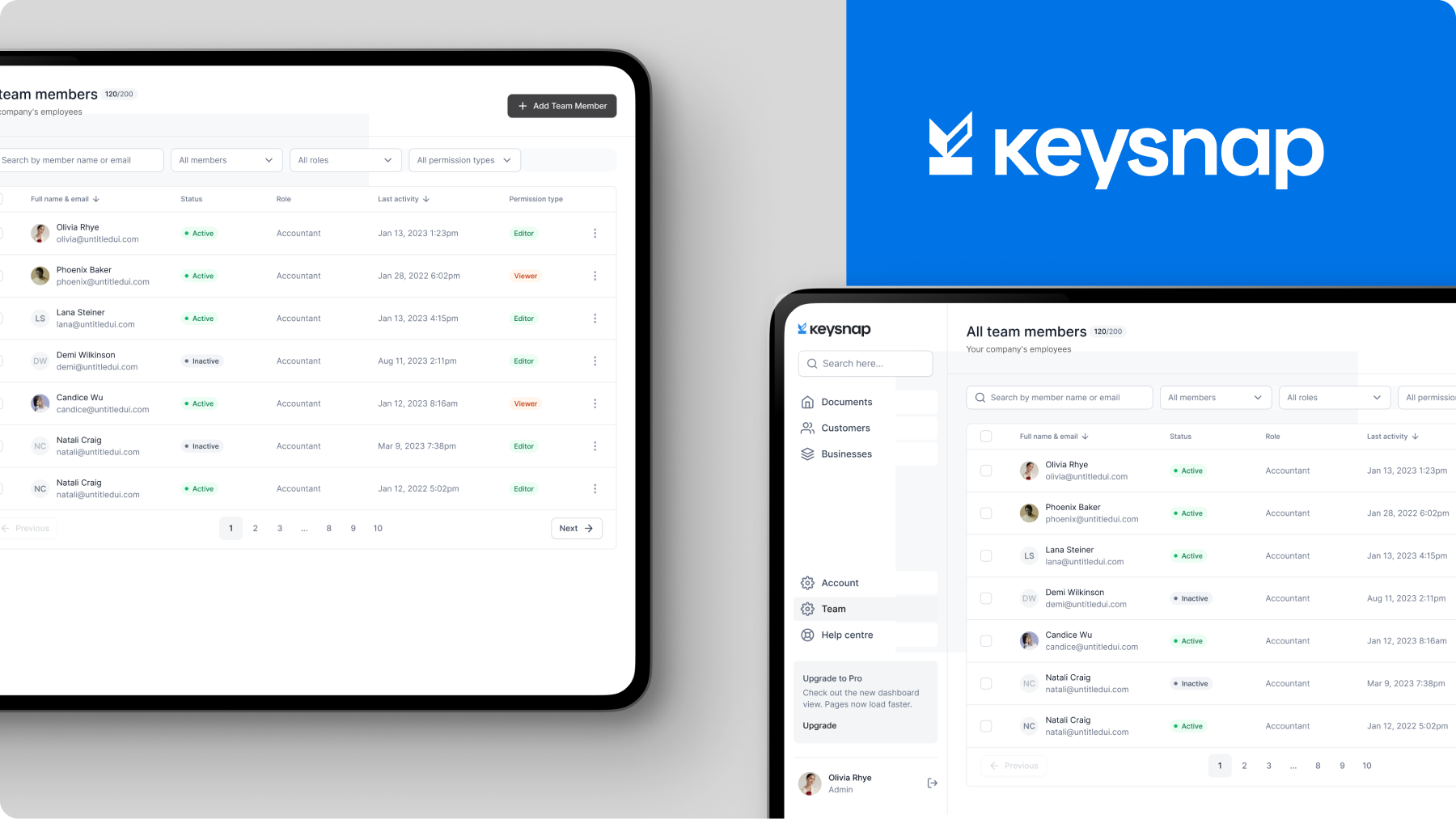
Along with a name, Keysnap needed a fresh brand identity and a website foundation that could scale with the product. With only one page, there was very limited space to introduce the new brand and product offering to a diverse target audience. Each audience required different content at different stages of the journey to complete different end goals.
- B2C consumers needed a reason to switch to Keysnap from their existing software or systems.
- Financial professionals needed to understand how Keysnap brings efficiency to their business’ everyday workflows.
- Major banking institutions needed proof that Keysnap not only keeps their client data safe but also that it’s a key enabler of client success.
As a B2B software that handles sensitive financial data, Keysnap was struggling to earn the trust of prospective customers and partners without testimonials, case studies, or awards. To overcome this challenge, they needed to quickly and effectively communicate the pain they solve and attract early adopters that could become future case studies.
Solution
Our naming process began by learning everything about Keysnap’s technology and vision for the future. We completed iterative brainstorming workshops to identify relevant themes, research word connotations, and rank potential names using specific naming criteria.
We studied brand names in Keysnap’s competitive landscape to understand:
- What other companies and products play in a similar market space
- Clusters of common naming conventions
- How to stand out from the pack
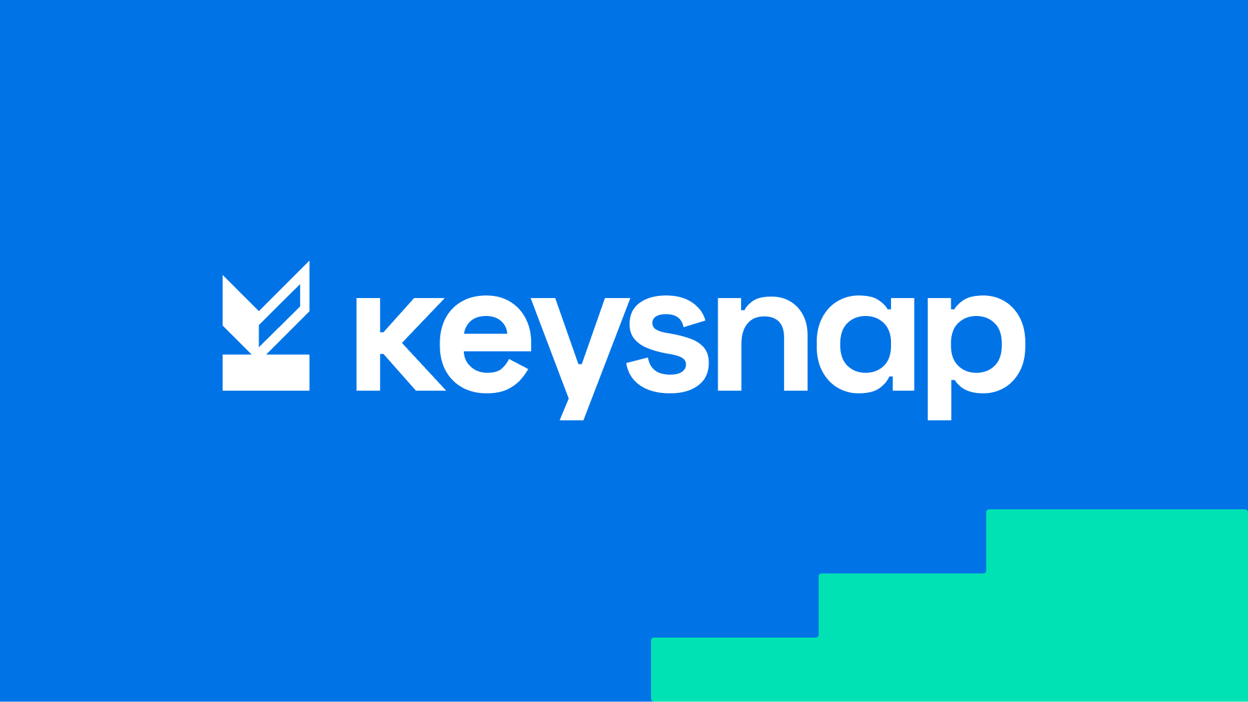
The name “Keysnap” rose to the top of the list:
- “Key” = keys on a keyboard
- “Snap” = speed and ease
The name is catchy, memorable, has a relevant indirect meaning, and has a high potential for differentiation and growth with .com domain availability. The new name set the stage for a rich brand story and visual language development.
Using Keysnap is easy and quick it feels like snapping your fingers. To encapsulate this feeling, the Keysnap brandmark is designed to look like a checkmark by turning the letter “k” of “Keysnap” on its side.
The brandmark’s simplicity and versatility make it easy to reproduce across various mediums and platforms. Inspired by energy and technology, the primary colors pack a vibrant punch, while the secondary colors allow for flexibility when creating brand graphics, data graphs, iconography, and other applications. Visualization tools like white space, product illustrations, and animations were used on the splash page to highlight key product benefits and tell a compelling brand story.
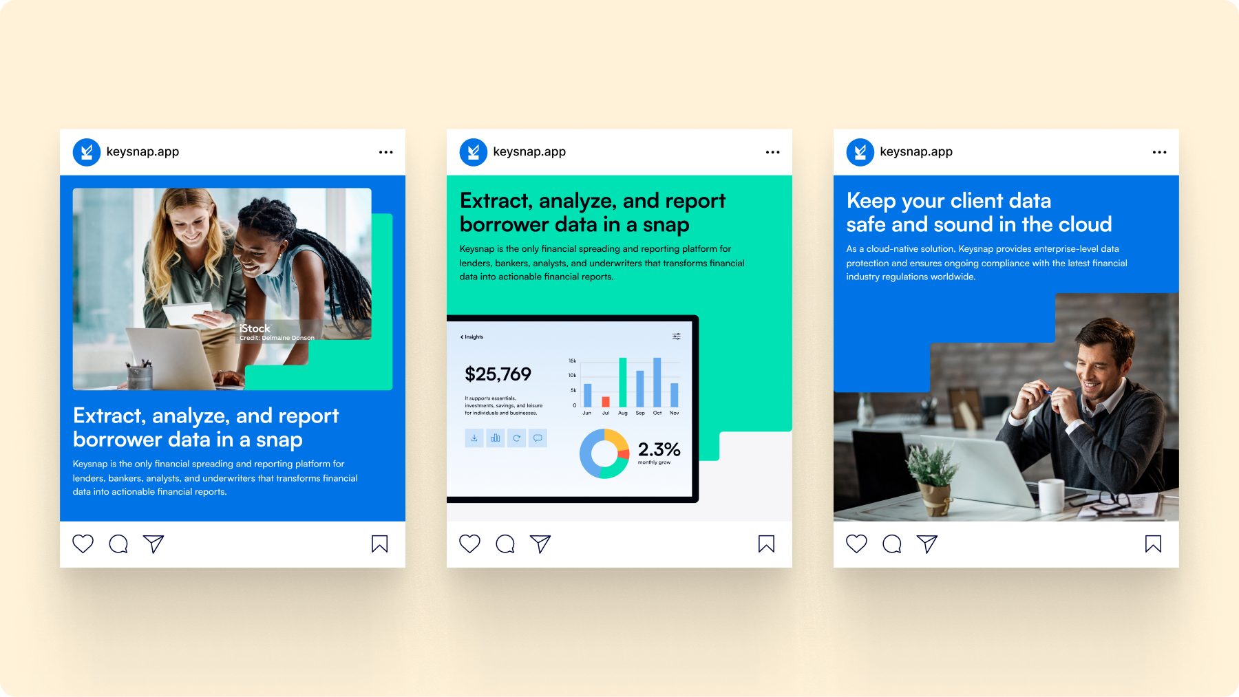
To clearly communicate the value proposition, we categorized Keysnap’s benefits and product features around three core capabilities: To extract, analyze, and report borrower data. We kept the splash page clean and concise, making it easy for potential customers and bank partners to find information relevant to them.
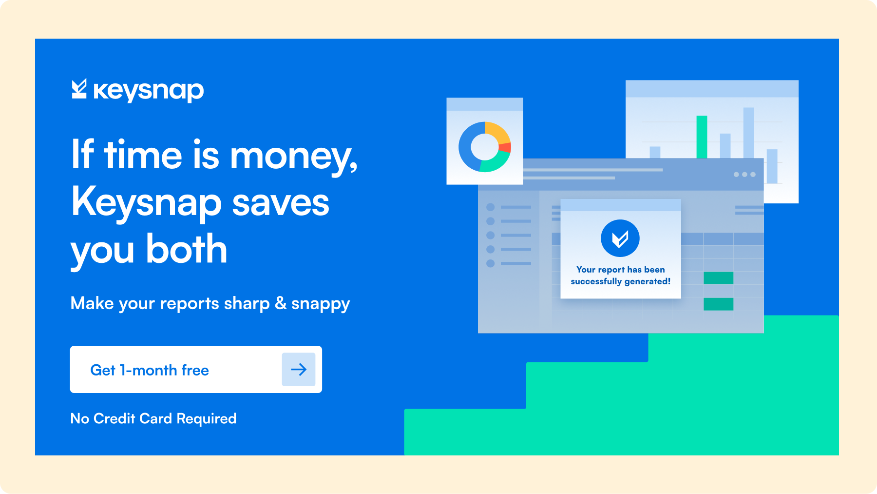
- Instead of a generic “Get a Demo” button, we included a bright blue “Try 1-month free” CTA button at the top of the splash page to incentivize sign-ups with a clear offer and time-specific language.
- We used microcopy on the pricing matrix to address buyers’ potential fears, uncertainties, and doubts, including how much you save with each plan and that no credit card is required for initial sign-up.
- Right before the bottom CTA, we included several security certifications and addressed major buyer objections to reassure users that Keysnap meets the latest financial industry standards and regulations worldwide.
Results
With a new name, brand identity, and website in hand, Keysnap was equipped with a firm foundation for marketing and selling to financial institutions, early product adopters, and investors. Although it is still early days, we are excited to watch Keysnap’s brand and product continue to grow and evolve as they scale.
Browse more case studies.
Fan engagement platform rebrand attracts sports and entertainment giants
Read case study