


Read


Letter from the Founder 2023
Read Tiller Founder & CEO, Chantelle Little's reflections on 2023 and a few of her personal highlights from the year.
These days, almost anyone can get a website up and running with ease.
But that doesn’t guarantee it’ll be effective for your business.
Your website is your 24/7 storefront. You have five seconds to capture your customer’s attention, so it’s important to make a good first impression with appealing, intuitive and effective design.
If you had a physical storefront like a coffee shop you wouldn’t want it to seem boring or unfriendly. Piercing fluorescent overhead lights and unforgiving concrete floors are cost-effective and easy to install, but they probably won’t give your customers a great first impression, much enjoyment, or elicit recommendations.
If you care about your customers and take pride in your space, you can create an environment that people want to support. You won’t just be any old coffee shop. You’ll be an important part of the neighbourhood. A daily destination.
Think about your website’s design the same way.
Let’s look at 12 web design best practices that will help ensure your website’s success in 2024.
We’ve talked about the value and importance of creating a strong brand identity. Because your brand is the foundation of your business, it’s important to keep branding consistent across all of your customer touchpoints. That includes your website.
Your logo, colour scheme and iconography should remain consistent. The same holds true for your brand voice and key messaging. You want to reinforce your value proposition, aesthetics, and tone across your website.
Make sure to build off the foundation you laid down during the creation of your brand. A focus on consistency will enable your marketing efforts and help build brand equity.
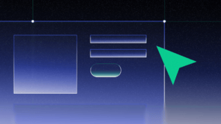
Your calls-to-action (CTAs) motivate your customers to convert, whether by purchasing your products, subscribing to your content or booking a call or appointment.
So, how do you make sure your CTA is as powerful as it can be?
Let’s use Netflix as an example.
There are a few things to take note of here.
Spur your users to action with a powerful CTA and you’ll see stronger results.
Your website might give your users a solution to complex problems or access to lots of helpful content. But it shouldn’t be a treasure hunt. Your navigation and buttons should be clear and obvious so users can explore your content intuitively.
There are a number of ways to accomplish this:
If you make it easy for users to navigate your website you’ll give them a deep, engaging experience, and a clear path to convert.
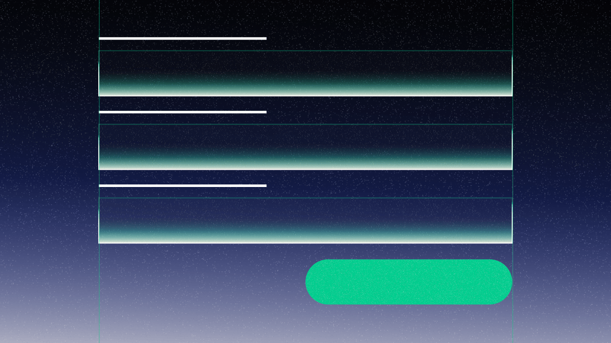
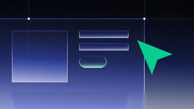
It’s important that your website is easily scannable and your content is digestible.
It’s a good practice to be sensitive to your user’s cognitive load. You don’t want to overwhelm people with an explosion of colours, images and copy. Instead, make your website easy and enjoyable for them with clean design and meaningful (and only meaningful) content.
One way to do this is to establish a visual hierarchy. It’s the arrangement of all the design elements of a website in order of importance. For example, if a headline is large, contrasting in colour and centred on a page it immediately comes across as being more important than something smaller, not uniquely coloured, and offset.
It’s also important to use white space effectively. White space is the ‘negative’ space between the layout elements, paragraphs and visual components. Designing with white space in mind will make your content more scannable, digestible and easier on the eyes.
Stories are the most common way that humans make sense of the world and connect with one another. We all have insatiable appetites for good storytelling.
The very best stories deliver emotional impact. That’s one of the primary ways they break down barriers to engagement and understanding. That’s why you can connect more effectively with customers by leading with storytelling rather than with facts. And websites, in particular, can benefit by integrating brand storytelling and narrative techniques.
Imagine a group of people traveling across rough waters. They’re on a quest to change the world but so much of what lies ahead of them is unfamiliar. And the journey is long and potentially treacherous. They need someone who knows those waters to help guide their ship away from danger and to safe harbour across the sea.
The Tillerman is that guide.
That’s actually where the name Tiller comes from. It’s often the first story we use to illustrate our company’s purpose. It’s particularly useful because the metaphor translates directly: it’s our role to help our clients navigate brand, website, and product design. We know those waters well and we’ll help you cross them safely.
We could list facts and statistics about how we’ve enabled other companies in the past, and we do, but that first story is so important in telling people who we are as a company and how we can be of service.
Have you ever tried to read a novel to a very young child? It doesn’t usually go over well. They want to see pictures because it’s the visuals that help them understand the story. Web users are similar: short attention spans, low tolerance for text-heavy content, and an affinity for engaging visual elements.
Many websites fail to engage users because they require that they read endless lines of text to understand what the company has to offer and why they should care. Conversely, websites that limit text and incorporate plenty of visual design elements (photos, videos, and illustrations) tell the story in a way that users can quickly digest. Product screenshots are especially impactful in the tech and software space. They help users understand what the product does and what sort of experience they can expect, without lengthy and technical descriptions.
Designing for mobile should be a priority, not an afterthought. According to 2023 research, mobile devices make up 58.67% of global website traffic.
Understanding how your target audience engages with your content makes your website effective, enjoyable, and easy. One way you can optimize your website is to build mobile-first and mobile friendly.
Now, there are some restrictions when you’re designing for mobile. The screen isn’t as big, people interact with content differently than they do on a desktop, and so on. But, these restrictions can be a good thing. They make for a leaner, more digestible website.
With mobile-first design, you can help to optimize every user experience, no matter how they engage with your content.
Website accessibility means designing websites and applications that can be used by individuals who have visual, motor, auditory, speech, or cognitive disabilities. And less than 5% of websites are considered accessible.
Here are a few examples of how to ensure your website or application is accessible:
If you’re unsure how your website measures up on accessibility, use an accessibility auditing service (there are lots of them online). They can help you determine whether your website works with assistive technologies so you can make any necessary changes.
SEO is far from dead in 2024. But with the rise of AI it is evolving. And fast. Like always, if you integrate SEO best practices into your website, you’re more likely to land a high-ranking placement on search engine results pages (SERPs) and get more website visitors. Especially if you focus on promoting the human experience in a way that AI can’t serve up. Optimizing solely for Google bots is out. Now, rankings favor pages designed that stand out
Here are some additional ways to optimize your website for search engines in 2024:
Integrating SEO principles in your website will increase the organic traffic, potential customers, and visibility you receive.
A slow website doesn’t just frustrate your users. It can have real consequences for your business as users will often abandon a slow site. In 2024, Google reported that a website's bounce rate increases by 32% when the loading time jumps from one second loading times to three second loading times. Google also considers site speed when determining your search rank, so if you want to be visible you should make sure your website is fast.
There are a number of free tools, such as Pingdom and Website Audit, that can quickly provide you with site performance metrics. They measure key performance indicators like load time, page size, and image compression.
A website with lots of design features will be slower than a leaner website. Multiple typefaces and font sizes are an example. Loading a library or framework for animations can also make your website slower. It’s important to seriously consider each element of design so you don’t slow your website down unnecessarily.
Heatmaps present visually striking feedback on where users are spending time on your website. They track your users’ mouse movements so you can identify the areas that receive the most attention.
With this information you can:
With a heatmap, you can make improvements with the confidence that these improvements are data-driven.
A/B testing is a method of comparing different versions of a webpage to see which variant performs the best for a given goal. This could include assessing how effective a CTA is, what headline works better or what images and other visual content elicit positive responses.
There are two types of variants:
Micro variants: Small, focused changes like changing the color of a CTA button or adding a word to a headline. These can add up to a 2% change conversion impact.
Macro variants: Major revamps such as wireframing the page or recreating every design asset. These can increase conversion by 40-300%.
Even though macro variant testing usually leads to a greater impact on conversion rates, it comes with an opportunity cost. To limit resource burnout, consider these strategies:
Collecting the right data takes the guesswork out of website optimization. When enough data is collected, Google Optimize can determine whether the changes you made had a statistically significant effect on conversion and if you should consider implementing them.
There’s a lot of information here, but the most important takeaway is that if you want business results you can’t just build a website and then leave it. Your website requires ongoing optimizations and improvements to serve your customers and company. This is particularly true if you’re going through a full website redesign.
Here are three of the key things to remember, whether you’re making tweaks to your site, refreshing it, or building it from the ground up:
At Tiller, we can help you with every step of the website design process. From planning out your website’s design to delivering ongoing maintenance, and conversion rate optimization, our team has the expertise and skills to help you get results.
Read Tiller Founder & CEO, Chantelle Little's reflections on 2023 and a few of her personal highlights from the year.
Learn best practices for B2B web form optimization. Read about form context, form length, required vs optional fields, and more.