

Barter with Exmerce: Unconventional strategies & how to navigate through a recession
Listen to an interview with Exmerce Founder Nelson Liem, and discover how barter can help you expand your market during an economic downturn.
Weight loss programs. Mid-life crises. Career changes. At one time or another, we all reinvent ourselves. We make changes to become more like the person we want to be – the person who has what it takes to make our dreams a reality.
Similarly, a brand may need to be reinvented – rebranded – to realign with a business’ vision and to stay on track to achieve their goals.
There are many reasons for rebranding:
In this article we’ll show you six exceptional rebranding examples and break down what you can learn from them to help guide your own rebrand. But first, let’s define rebranding.
Rebranding is like a home renovation. Something needs improving – it’s usually the kitchen – so you make a plan, do a little demo, and make the improvements. Similarly, rebranding requires strategic planning and deconstruction in order to create something new. Something better.
Many people think of rebranding as simply changing a logo, but it’s more broad. Your website, brand voice, messaging, marketing assets, etc., are all key elements that may be included in a rebrand.
If you were renovating your kitchen you wouldn’t (at least, we hope you wouldn’t) start knocking down walls and rewiring electrical without first creating a detailed plan.
Rebranding strategy is that plan. It’s the blueprint that defines the core elements of your brand and how they will position your brand within your target market. Your core brand elements include:
There is no one formula for a rebrand. The strategy should be dictated by the reason for rebranding. It’s a highly collaborative process that should be uniquely crafted with a design partner that specializes in brand strategy services.
Slack, founded in 2013, is an online business collaboration tool that improves efficiency and team productivity. Slack’s original icon was an angled colourful hashtag (in case you’re wondering, it’s technically called an octothorpe). The hashtag was chosen as the primary icon as it was also used to represent individual channels of communication within the tool. Unfortunately for Slack, the hashtag was quite ubiquitous due to social media.
The hashtag’s colour palette was also problematic – there were 11 different colours. Slack found that when the logo was placed over various coloured backgrounds, or if the hashtag’s colours were slightly inaccurate, it appeared distorted. In their own words, “it looked terrible”. They created multiple versions of the logo to try to combat the visual nightmare, but this only created confusion around their brand identity.
Slack rebranded in 2019 with the goal of creating a consistent and cohesive brand. The technicolour hashtag was replaced with a mark comprised of rounded lozenge shapes and speech bubbles to represent communication. And instead of 11, Slack chose four primary colours.
The icon was paired with either a black or white wordmark that was distinct and easily readable on a variety of backdrops, including Slack’s iconic purple.
Slack rebranded to establish a more consistent brand identity, but didn’t want to risk a loss of brand equity. This can sometimes happen with a drastic rebrand. To avoid this, they maintained some of the original colour pallet and created their new icon to be similar in shape to the original hashtag, effectively preserving brand familiarity.
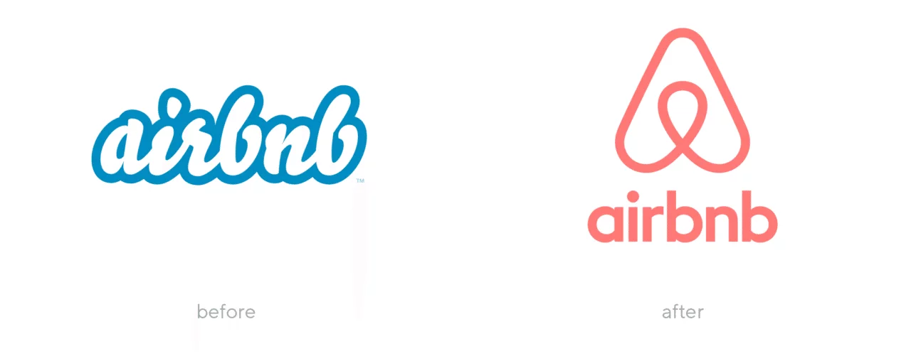
No vacancy? No problem. Airbnb’s online accommodations marketplace launched in 2008 and capitalized on the idea of “rent anywhere”. They empowered homeowners to earn extra cash and provided travellers access to unique living arrangements around the world.
Airbnb decided to rebrand and clarify their message in 2014 to realign with their core values – community and global connection. They shifted from “rent anywhere” to “a place for everyone to belong”.
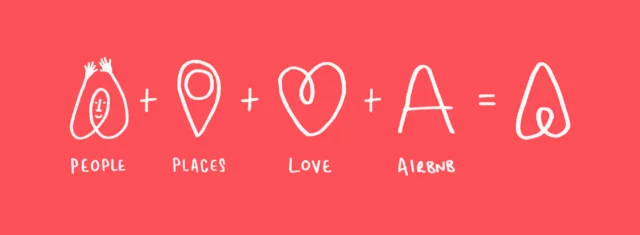
To clarify this message to their customers, Airbnb created a unique icon named the “Bélo” – a combination of four concepts: people, places, love, and Airbnb.
The Bélo bridged language, culture, and location. It was a universal symbol people could connect with and even draw themselves. Airbnb even challenged brand guideline norms by encouraging people to personalize the Bélo for their own rentals.
Was it a success? Well, the numbers don’t lie. In the two years following the rebrand, Airbnb experienced over 80% growth in revenue. In recent years they have continued to break away from the constraints of “rentals”, and repositioned themselves as curators of experiences. Now you can book a rental, cooking lesson, and wildlife tour – all through Airbnb.
Airbnb’s rebrand was not only a significant visual improvement (the previous wordmark was quite outdated), but it gave their global audience a message they could connect with. The unique Airbnb symbol added versatility to their brand visuals and marketing assets, and effectively opened the door to future diversification.
Growth is a good thing – as long as your brand can grow with it. Zendesk is a global customer relationship software company that has been around since 2007. They started with a single customer service product, but expanded to offering six distinct products ranging from live chat to analytics and reporting.
Zendesk’s original brand was rooted in the word “zen”, and the lotus flower and cartoon Buddha were elements of the logo that emphasized peace and tranquility.
Unfortunately, Zendesk found that their brand was not easily scalable. They wanted to maintain the playful personality of their brand, but realized they required a more sophisticated and modern look in order to grow.
The final product of Zendesk’s 2016 rebrand is impressive: a geometric theme where several shapes come together to form a “Z”. But beyond the logo, Zendesk branded each individual product with a unique combination of two shapes. No matter which product you use, the brand experience is the same.
Zendesk’s modern looking rebrand realigned them with their growth ambitions and better targeted their business-oriented audience. More importantly, the rebrand introduced their expanded product line with a cohesive theme that carried through from the logo to each individual product.
We love providing business branding services to our clients. It’s an exciting process to determine the best approach for how to rebrand a company, but it’s especially rewarding to see the positive, sometimes dramatic, results that follow a rebrand.
Case Study Buddy is a team of unbiased third-party specialists that create compelling case studies businesses can use for outbound sales, inbound marketing, authority building, or staff training.
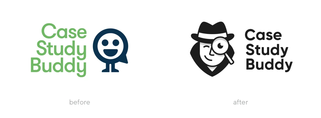
Joel Klettke, Founder of Case Study Buddy, came to Tiller in early 2018 with several pain points around the existing brand. He liked the playfulness of the existing brand, but found that it wasn’t attracting their target audience of enterprise-level clients. They needed a rebrand that would still portray their fun and memorable personality, but would reflect a more professional and premium service. This was especially important as Case Study Buddy was in the process of expanding their offerings and adjusting price points to reflect their expertise.
After several logo iterations, we decided on a custom icon of a detective peering through a magnifying glass. This design was cleaner and more professional than the generic avatar icon used in the old brand, and the detective was symbolic of Case Study Buddy’s mission to investigate and reveal results.
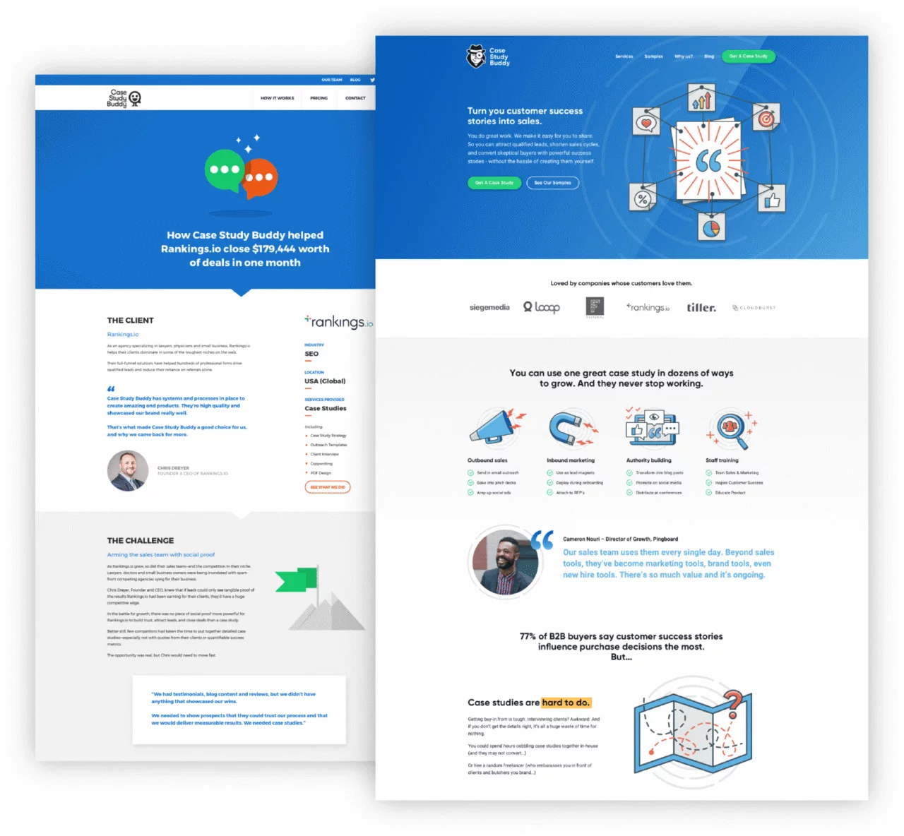
The rebrand included an overhaul of Case Study Buddy’s visuals (logo, colour palette, typography, illustration), website, and PDF case studies. All done with the goal of scaling and targeting a more sophisticated audience.
Case Study Buddy experienced 233% growth in revenue post launch. Their new brand attracted more enterprise-level clients and they even signed their first Fortune-100 client.
Case Study Buddy had a successful business with a dedicated team of experts, but they recognized that their brand was holding them back. If your brand isn’t positioning you in your desired place in the market, or if it isn’t resonating with your target audience, a rebrand may help you get back on track.
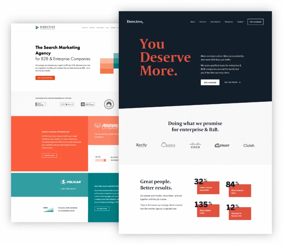
Directive Consulting is a digital marketing and SEO agency that helps businesses acquire new customers through search engines. Headquartered in Irvine, California, they also have offices in New York and London.
Directive came to Tiller shortly after narrowing their target audience to B2B companies. They recognized that their existing brand was too broad and was attracting too many of the wrong customers. They needed their brand to reflect a high-end service that was tailored to enterprise clients, worldwide.
Their existing brand was bright and approachable, with a playful feel. But to appeal to their global B2B audience they needed something more confident. For their logo, we created custom lettering with a timeless and classic style, and paired it with a more sophisticated colour palette.
Through our collaboration we discovered that there was a specific element of Directive’s existing brand that was working to their benefit – an arrow signifying growth and momentum. The arrow would still resonate with their newly defined target audience, so we stylized it to fit with the new colour palette and style. This process of auditing which elements are working or not working for a brand is part of Tiller’s comprehensive brand identity design services.
The end result of Directive’s rebrand (which included all visual assets and a complete website revamp) was a confident and professional brand that would hone in on their global B2B audience.
Directive Consulting experienced 12% growth in revenue within one quarter of launch. They also decreased their bottom-of-funnel conversions by 52%, achieving their goal of prioritizing quality leads over quantity. When the rebrand was complete, a key Directive stakeholder commented, “this was the smoothest rebranding I’ve ever been a part of”.
A thorough and collaborative brand audit determined what was and wasn’t working for Directive. Rebranding doesn’t always require starting from scratch, and a combination of old and new elements may result in a stronger brand.
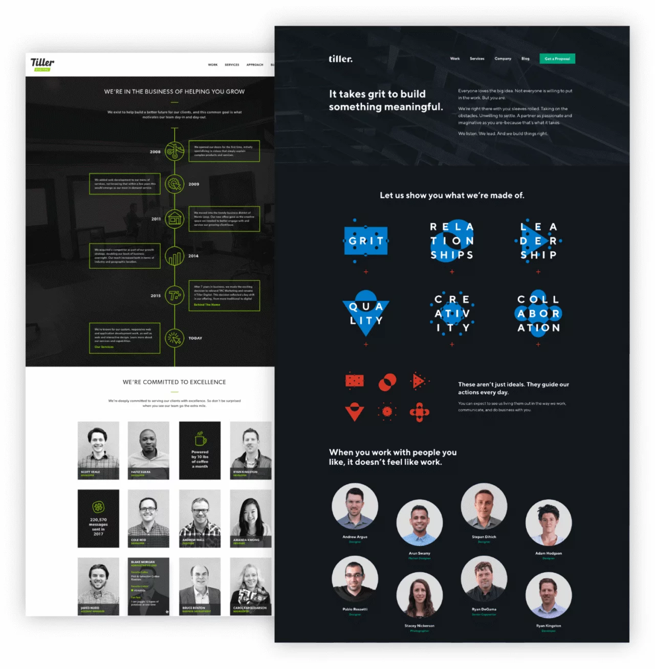
Tiller encountered a huge amount of growth in 2017. While the growth was exciting, we saw a ceiling on our brand. The brand had been crafted with a distinct small agency feel, but we needed a brand that would help us to scale and reach our newly defined audience.
During this period of growth we saw a shift in both our customer base and the web industry as a whole. In past years our clients were relatively small and were primarily focused on getting their websites live. Our brand matched their expectation, and our elevator pitch was often, “We build websites”.
But as we grew and sought to make a step up in the market, we needed to prove that Tiller was capable of working with larger clients who expected more out of their brand and their website. So we changed our pitch to, “We grow businesses”, and got to work on a rebrand that would reflect the business we would become.
We assessed our goal of repositioning in the market and attracting clients with larger budgets that would enable us to drive more impact. To achieve this we needed every touchpoint of the customer experience to build confidence and trust.
First, we tweaked Tiller’s brand story. The existing story was dual-focus – farming (tilling the soil) and nautical (steering the ship). We dropped the farming analogy and focused on honing our identity as a master helmsman. We also dropped the word “digital” from our visual assets to create a stronger, more iconic brand.
The nautical theme continued to guide our decisions. In fact, the inspiration for our custom lettering came from the name painted on a boat at moor in a little canal in Copenhagen – something we stumbled upon while on a business trip in Denmark. To emphasize forward motion, we gave the lettering a subtle forward angle.
After much deliberation we shifted to a bold and timeless primary colour palette – black and white. This would give us long-term flexibility to evolve our brand while maintaining the core characteristics and brand recognition.
But there was still something missing. How could we get our brand to instill more confidence in our clients? As it turns out, what we needed was small – a period. A period is used to mark the end of a declarative sentence and by adding it to our logo we created a sense of finality that said, “Hire Tiller and get it done, period”.
While the addition of the period was a nice design element, it was more than that. It spoke to our confidence as an agency, a confidence that would pervade our messaging, website, values, etc.
Rebranding Tiller was about much more than a new logo. It was about taking ownership of who we are and what we are capable of doing for our clients.
Since rebranding in 2018, our brand has given us a seat in front of our target audience – larger B2B and even enterprise-level clients. After rebranding we experienced a 100% growth in revenue. This growth continues today as Tiller consistently delivers more and more value to our clients.
Your brand has to be a step ahead of your business. You can’t wake up one day and think, “I want my brand to instill confidence in this type of customer.” You build your reputation and brand awareness before that happens. If you don’t, you might miss the moment.
Rebranding is daunting. We’ve experienced it ourselves and know it isn’t easy. But as you saw in the rebranding examples above – it can result in serious growth.
Remember that identifying your reason for rebranding, whether it’s repositioning, modernizing, or changing your message, is the most important step and will inform your entire rebrand strategy.
Whatever your reason, if your brand isn’t delivering to your goals, it might be time to rebrand.
Get our Founder & CEO's monthly insights on the ideas, challenges,
and shifts fueling growth-minded B2B SaaS marketing teams.


