


Read


The history of web design
The history of web design has evolved over the years and has impacted modern-day marketing and brand strategy. Learn more today!
In every aspect of life, we learn by observing the world around us. Then, we either imitate what we see or work to find a way to do it better. Web design is no different.
At Tiller, one of the ways we cultivate constant learning and growth is to conduct SaaS website design audits. We take a look at what we like and what we would change. We learn from seeing how other designers approach SaaS web design and add new strategies to our arsenal of design practices. Design reviews challenge us to think critically (in a good way), see what’s working well, and what could be improved.
Since our design team is always exploring and learning from successful B2B SaaS brands, we wanted to share a review from one of our designers.
Today, Tiller UI designer Andrew Argue takes a look at one of the best SaaS website designs out there, Asana.
Asana is one of the market’s leading team and project management SaaS companies. With tools and features designed for marketing, sales, operations, and product teams, Asana makes it easier to manage projects and tasks.
We’ve been following Asana for years at Tiller, and regularly check in on their website to see how they are evolving and improving their B2B SaaS website design to better serve their customers. It seems there’s always something new to take away, and this review was no different.
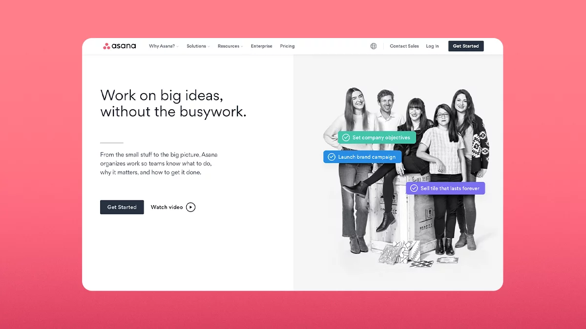
Andrew: Asana’s website fits its brand very well, and really is one of the best SaaS websites I’ve seen as of late. They showcase today’s modern web design best practices and have excellent usability. The website is clear, simple, and easily navigable allowing you to understand who Asana is and why they do what they do.
The design portrays a sophisticated and yet playful brand that highlights its product well and provides just the right amount of detail to educate and convert potential customers. Asana uses imagery, colour, typography, user experience (UX), and a mobile responsive design to create a cohesive, well-functioning system of design elements. Overall, this website design is easily recognizable as part of the Asana brand.
Andrew: Asana offers many features, plan options, solutions, resources, and more, so they require a vast design system full of various components and pages, all valuable to their users. If they were to use a regular dropdown menu on such a large website, this important information could quickly become buried in subpages.
A mega menu, especially one like Asana’s which includes page descriptions, allows a web user to navigate to all these pages easily. Mega menus have become common practice for SaaS web designs that have a lot of valuable information to share with users. I’m definitely a fan of using them.
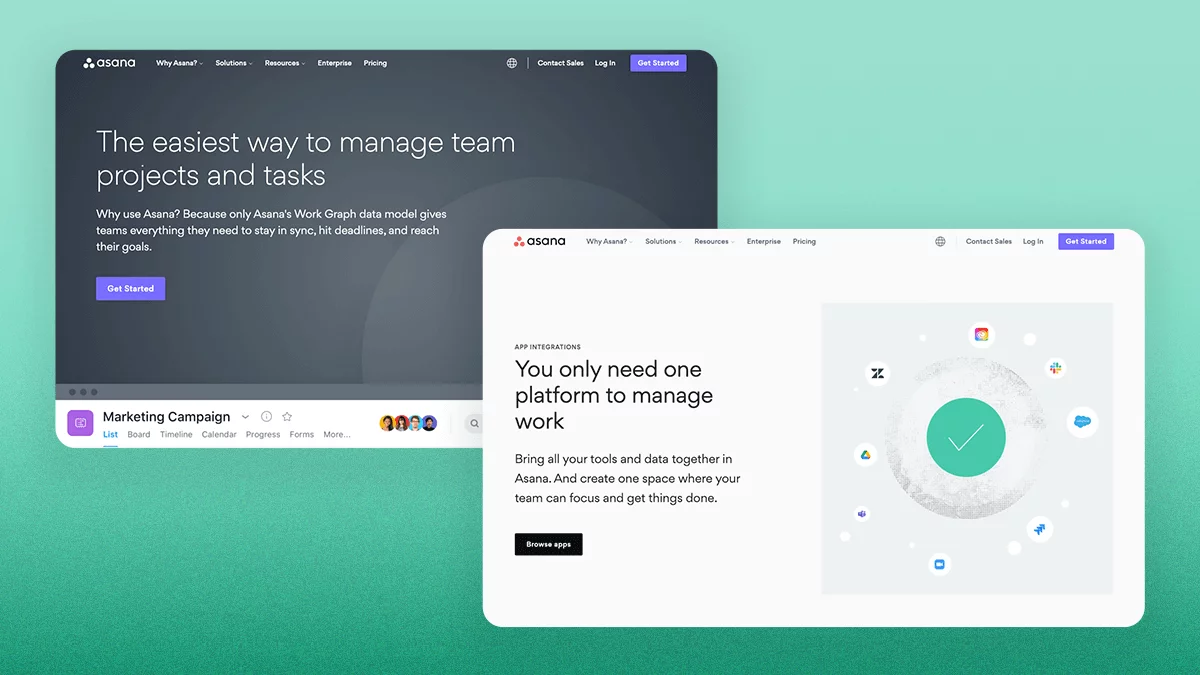
Andrew: Asana has a robust and well-functioning design system. They use typographic styles, illustration, photographic styles, iconography, product shots, animations, colour, balanced layouts, and a highly functional user experience to deliver an excellent user experience aligned with today’s web design standards.
Andrew: Fat footers are often used to highlight pages with a high search volume, especially pages that would be otherwise hidden on the site. Essentially, fat footers function as a secondary navigation. They are good for SEO and are especially helpful on expansive B2B SaaS websites with a lot of content, like Asana. I think they made the right choice to include a robust footer as it really does make it easy to find the page you’re looking for.
Andrew: Every touchpoint with a company can influence people’s perception of a brand, so it’s important that the design is consistent. Asana has a well-defined brand that has been accurately translated through to the SaaS website design. The colours are used throughout the site to create a consistent experience, no matter which page you’re on. The palette also speaks to the brand personality (empowering, purposeful, approachable, and quirky).
Asana often uses bright colours to highlight functions, CTA buttons, projects, and hover states, while lighter, or muted colours are used in less important or background areas. This brings attention to areas that call for action or are extra important to focus on, creating depth and hierarchy.
If there was something I would change about the use of colour on the website, it would be the inconsistent application of dark UI and light UI in the PFA (primary focus area) on a few pages. For example, almost all the product feature pages have a dark PFA, while the “Automation” page (and others) use light UI. Variety within unity can often be used strategically to add visual interest and distinguish different types of content. Too much variance, however, can create some inconsistencies and communicate a slightly different tone within the website.
Andrew: The typography on Asana’s website allows for very clear readability and consistency. We know that web users are scanners, so it’s important that the type has a balanced hierarchy, flows with a consistent rhythm through the pages, and is overall easy to digest.
The chosen typeface feels very on-brand for Asana and fits their personality. The round, geometric, letterforms feel modern, approachable, and intentional. And visuals balance the type well.
Andrew: Asana uses imagery very well to balance the typography and add clarity to the content. They not only break up the copy to make the information more digestible but add context by providing visual descriptions to the design. You clearly get a sense of how the product will look and function in the real world.
If I were to change a few things, I would try to bring a bit more consistency to the imagery styles:
They have a few different icon styles. For example, the icons used in the mega menu and on the “App Integrations” page are different styles. In some instances, this can work to add visual interest in design, but in this case, I feel it would be more effective to keep it all the same to create a consistent brand experience.
While Asana may be a playful brand, it’s also a highly sophisticated SaaS company. There seems to be a mix of illustration styles that don’t properly balance the playfulness with the sophistication that is communicated in other areas of the website.
For example, the “Timeline” page uses a different tone than the graphic, geometric, textured style of the blog graphics. While they are unified by colour, it could be easy to confuse these two styles for different brands.
Andrew: When we design SaaS websites at Tiller, we sometimes opt to use small components of product designs or slightly simplified abstractions (rather than actual product screenshots or videos) to make it abundantly clear what the SaaS product does. This simplified approach can make the product features and functionality more digestible, especially if the actual product UI design is out of date or not on-brand.
However, if you have an incredibly well-designed product as Asana does, the risk of brand inconsistency is very low, and including real product shots can give people a sense of what to expect when they get started with a free trial or purchase a subscription. Asana does a great job of highlighting their product, not only by including a lot of product imagery but by animating them to mimic the actual functionality of the product.
The history of web design has evolved over the years and has impacted modern-day marketing and brand strategy. Learn more today!
We interviewed Gursh Bal and Kai Fahrion, Co-CEOs at Virtuoso Energy. Learn what inspired their startup and get their take on Alberta's tech future.
Get our Founder & CEO's monthly insights on the ideas, challenges,
and shifts fueling growth-minded B2B SaaS marketing teams.


