


Read


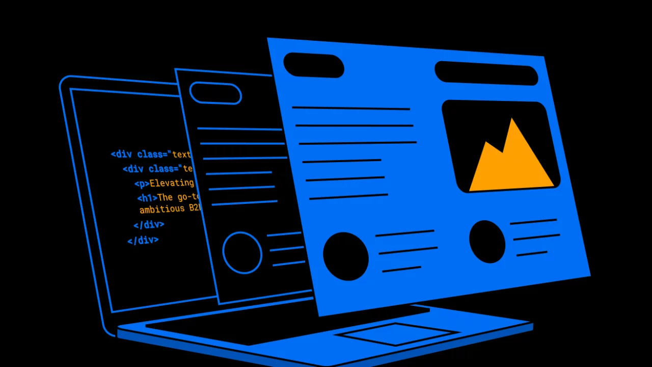
Standards-based web design
Standards-based web design helps users know what to expect on your website and know how to use it. Click to learn how standards can improve your website.
Nonprofit marketing has come a long way from telethon campaigns. Research has shown that the percentage of nonprofit donations given online is steadily rising year over year – 23% in 2019, up from 15% in 2018.
In today’s digital age, a website is a powerful tool that extends a nonprofit’s reach beyond their community to passionate supporters worldwide. And, not surprisingly, more and more of these supporters are accessing nonprofit websites from their mobile devices.
Nonprofit Source reported the following mobile-giving statistics in 2018:
These stats set the stage for Google’s shift to mobile-first indexing in September 2020. At that point, Google will evaluate your website’s mobile version before desktop to determine page ranking. So if your nonprofit website design isn’t already optimized for mobile, it’s time to seek out responsive web design services and revamp your site.
Today’s nonprofit organization can benefit from using the same web design principles as a B2B software as a service (SaaS) company and present:
Consider the SaaS company Slack. Slack tells its prospective customers a story: if you use Slack “your team will be productive no matter where you’re working from”. There is a problem (poor productivity) and a solution (Slack’s software) that will create an impact (improve productivity).
Nonprofit websites should be no different. The purpose of the site is to tell people a story about a problem, a solution, and the impact that will result from their involvement. Today’s online donors need (and expect) that level of clarity on a website. They want complete, end-to-end transparency around where the donation is going and its direct impact.
Effective nonprofit websites have four things in common:
Before we dig into some of the best nonprofit website designs, let’s unpack these four key elements and see how you can implement these into your own nonprofit website design.
Highly effective websites tell compelling stories. This is extra important for nonprofits. Why? Because a nonprofit’s work is often inherently emotional and stories bring that emotion to life. Stories help people emotionally connect to a cause and motivate them to donate their time, talent, or resources.
You can weave your story throughout your website’s design:
Your website is a powerful platform to tell your nonprofit’s story, so make sure you tell it well. At Tiller we typically recommend using website copywriting services. Copywriters specialize in clear and compelling storytelling consistent with your brand’s personality and voice.
Your website is a tool to drive action. Supporters can access it at any time, from any location.
Make it easy for people to locate the donation button and give on your site. Web design best practices recommend that the CTA should be a distinct colour and be placed in the top right corner of the page. You should also include CTAs throughout your pages, typically midpage and above the footer. This gives users a convenient way to take action as soon as they’re ready.
Beyond making it intuitive, make the physical donation process easy. Long donation forms can quickly become onerous. Limit forms to the least amount of information necessary. And where possible, break the form up into multiple steps with a progress indicator.
Payment gateways can be integrated directly into your website via an application programming interface (API) for secure transfer of financial information. At Tiller, we offer API integration services and typically recommend Stripe to our clients. Not only do APIs allow you to leverage an established and secure technology, but they mitigate liability in the event of a data breach. Donor’s financial information is all stored on the third-party’s server (e.g. Stripe), not on your website.
In addition to donations, nonprofit web design can include a secondary CTA for volunteers. Sometimes attracting volunteers is just as important as getting donations. And if someone is looking to give up their free time, you should make it easy for them to do so. Use online form submissions where possible and avoid having your volunteers download, print, and bring in a paper copy.
When you give your hard-earned money to an organization, you don’t want to donate and simply hope it goes to something worthwhile. You want to know it’s going to make a difference. Transparency around annual donation allocation, operating expenses, and revenue can help give potential donors the confidence they need to entrust their dollars with you, and can help safeguard against accusations of inappropriate spending.
Unfortunately, nonprofit scandals abound and potential donors can become jaded. Organizations have promised money is going towards a good cause but have been exposed as otherwise.
In 2016, the Wounded Warriors Project (WWP), an American nonprofit organization dedicated to the mental and physical wellness of veterans, was exposed for extravagant spending tendencies and a low percentage of donations. CBS News reported:
“Compared to other veterans’ organizations, Wounded Warrior is giving less to the people it serves…Disabled American Veterans Charitable Service Trust spends 96 percent of its budget on vets. Fisher House devotes 91 percent. But…the Wounded Warrior Project spends only 60 percent on vets.”
The leadership team was ousted and the WWP continues to work at rebuilding trust through financial transparency.
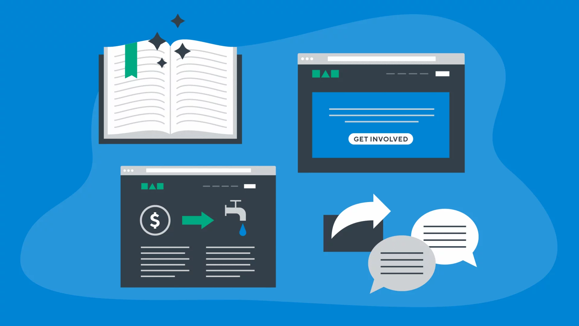
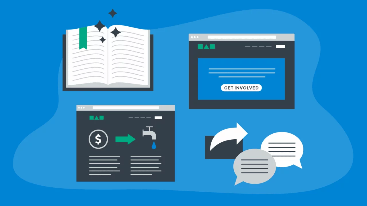
Whenever possible, share the inner workings of your nonprofit on your website:
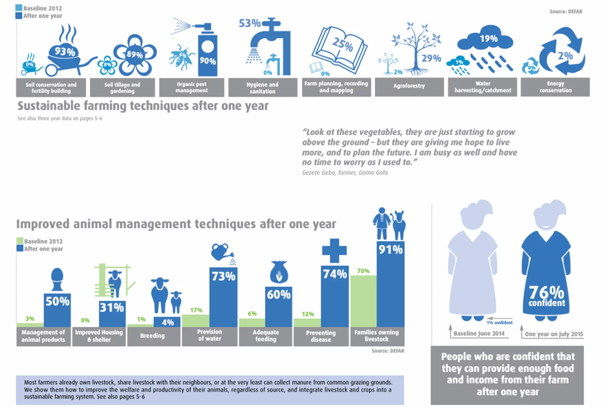
Send a Cow does an excellent job of showcasing transparency on their website. They break down the impact the nonprofit is having in specific geographical locations and each location has a detailed impact summary. This level of transparency contributes to prospective donor confidence and is rewarding for donors to read and see how their money is making an impact.
To maximize the impact of your nonprofit website, maximize donor and supporter engagement. Great stories are worth repeating, so make it easy for people to share it with others and increase your nonprofit’s reach.
Here are just a few strategies to increase engagement with your nonprofit:
The more people that know and support your nonprofit the better. Your website is the perfect hub for engagement. An experienced agency like Tiller can help you make the most of it with high-quality and effective web design and development services.
We’ve compiled a list of some of the best examples of nonprofit websites today to help illustrate how you can get the most out of your web design. We’ve also analyzed what we think we could change that would make these websites even more effective.
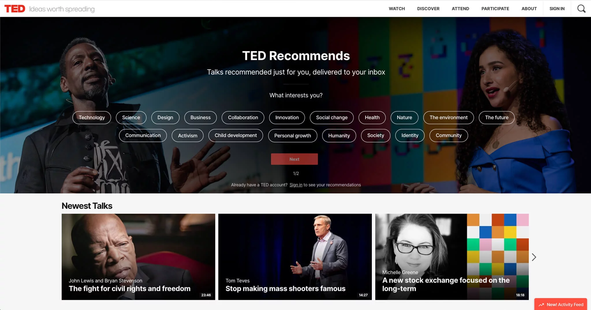
TED runs on ideas, not donations. It’s a nonprofit organization dedicated to informational sessions on any topic you can imagine.
Despite the enormous volume of video, the TED website loads very quickly. A collection of the most recent talks are presented immediately, but what caught our eye was the user journey. Users can immediately select topics of interest and sign up to receive relevant content via email.
We love that this is the first thing users see and expect that a large volume of people might sign up very early on in the user journey. These users can also use their email to sign in to the site and view content specifically tailored to their interests. We’re always a fan of personalized user experiences.
The main menu is strong – Watch, Discover, Attend, Participate, About, with drop-down menus adding context around the information on each page. For example, the first drop-down item under Participate is Nominate, where users can nominate a speaker to be featured on TED. Clear, concise menus reduce friction in the user journey by making it abundantly clear what the user will find on the page.
TED makes good use of the real estate in the footer. They highlight the spectrum of TED programs (e.g. TEDx, TED Fellows.), and communities (e.g. TED Speakers, TED Translators).
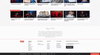
Traffickwatch is a nonprofit organization fighting against the evil of human trafficking.
https://tillerdigital.com/wp-content/uploads/2024/06/in-post-video-Traffickwatch.mp4
This website is immediately impactful. When you first load the page, you’re greeted with a black screen and an invitation to “Enter Traffickwatch”. While we typically discourage this gated approach to a website, in this case, we feel it contributes to the experience.
The homepage packs a punch. Music and video play automatically and you’re faced with multiple videos showing victims of various forms of human trafficking. It’s an emotional experience that cultivates immediate emotional connection and a clear introduction to the cause.
Imagery (both photos and video) is well balanced with messaging, and though the overall design is very strong and serious, it doesn’t feel stiff. Instead, real and very human. Small animations (flashes of colour) behind a few of the headings contribute to the intensity of the website.
The primary navigation is self-explanatory and guides users to the most important information – facts, stories, and impact. The “Discover Real Stories” page creates a powerful connection with victims of human trafficking. Details of age, gender, location, and type of trafficking help to weave the story of each victim. Plenty of white space surrounds each case, allowing you to focus in on each story individually.
Traffickwatch uses the “Make an Impact” page as a rally cry to join the fight against human trafficking. There are six distinct ways to get involved, each represented by an icon. The variety of financial and non-financial options increases the accessibility of the organization. Individuals who may not be able to give financially can still drive impact by advocating online, practicing ethical buying habits, etc.
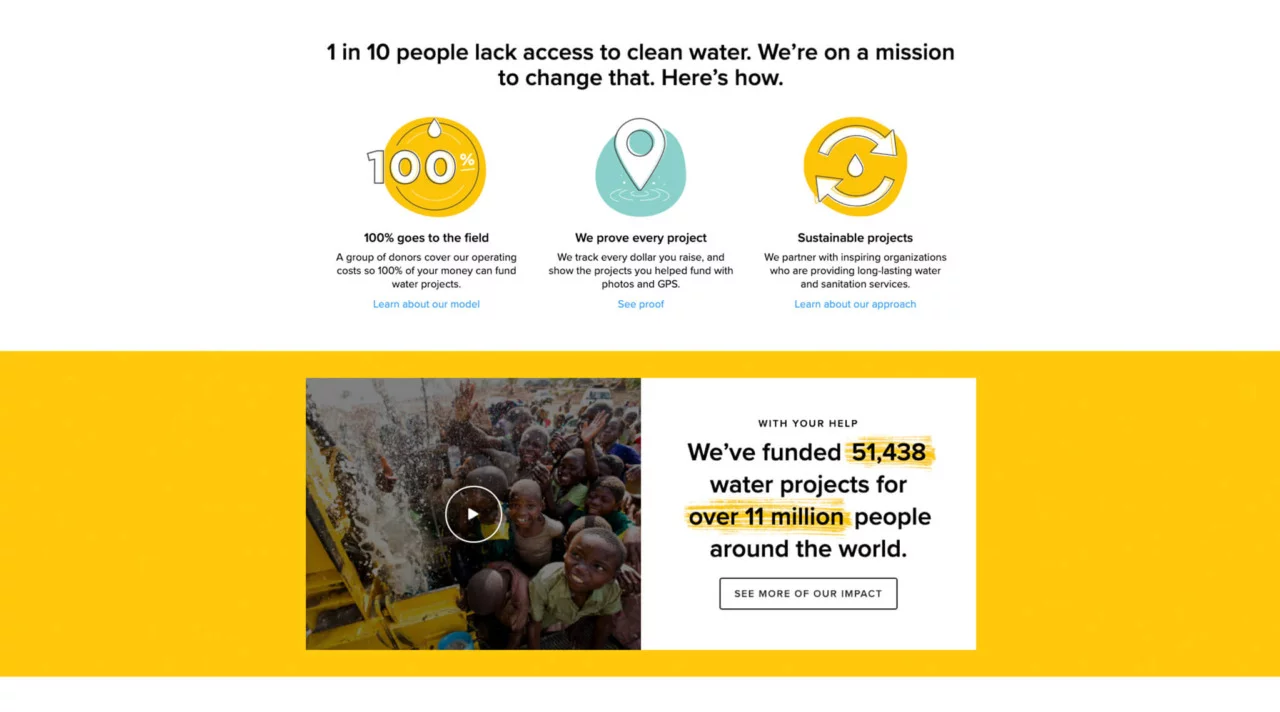
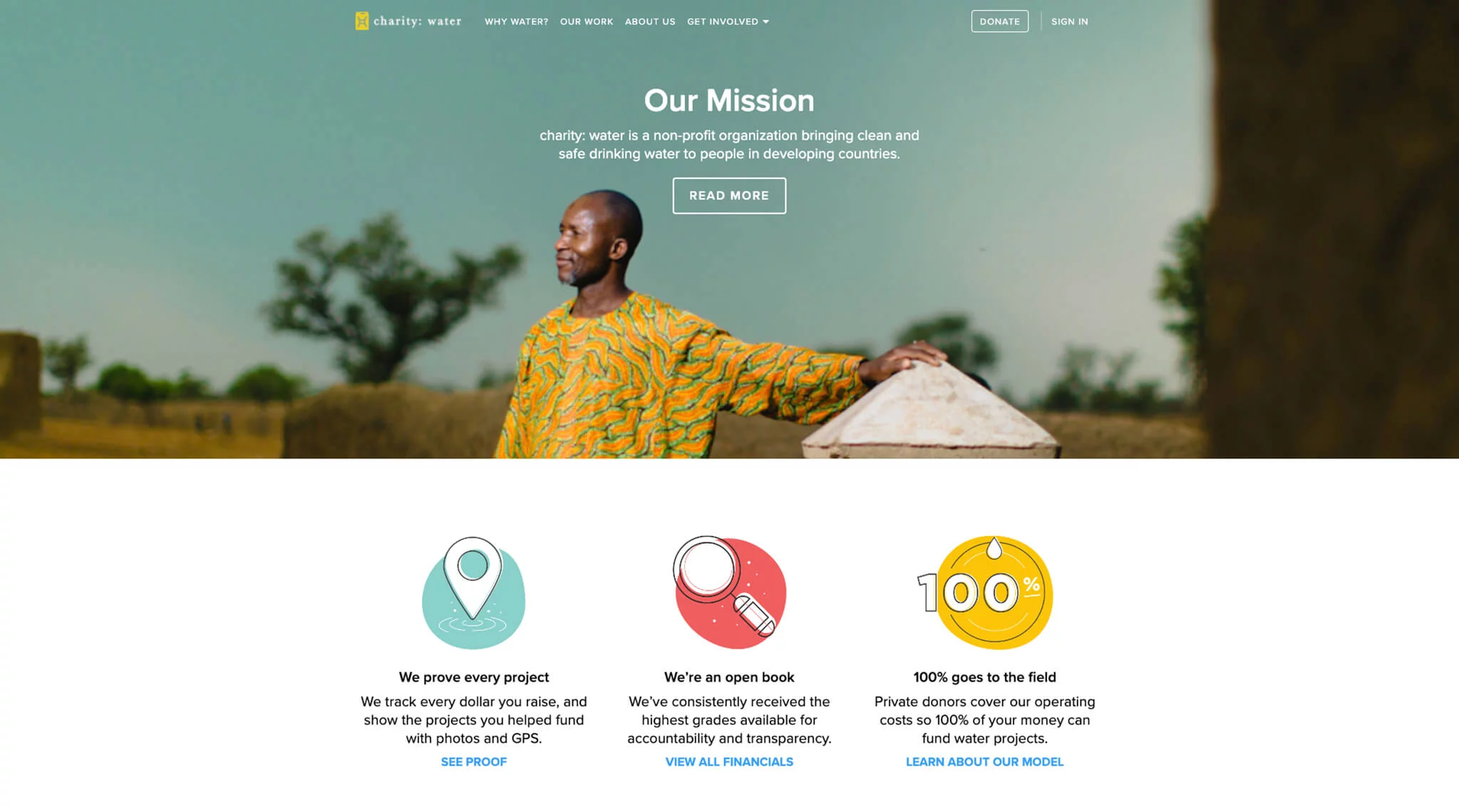
Charity: water brings clean, safe drinking water to communities around the world.
Charity: water doesn’t waste any time getting their mission out there: “1 in 10 people lack access to clean water. We’re on a mission to change that.” Messaging is clear throughout the site, with an obvious focus on transparency around where donations are going.
A powerful video midpage on the homepage depicts scenes of people before and after receiving clean water. This is an effective strategy to build an emotional connection with potential donors and to explain the impact of the organization.
The design is clean and simple, with a balanced combination of images and illustrations throughout the pages.
An effective website is critical to the success of your nonprofit. It’s a tool working on your behalf – 24/7, seven days a week. But simply having a website isn’t enough. To get results you need a website rich in story. One that connects to your audience on an emotional level and motivates them to partner with you and your cause. That kind of website has the potential to rally a global audience.
If your nonprofit website isn’t getting the results you need, Tiller can help. From strategy to mobile design to creative storytelling, we’ve got the expertise you need to drive serious impact with your website.
Standards-based web design helps users know what to expect on your website and know how to use it. Click to learn how standards can improve your website.
Learn about Tiller's web design process in this full guide. We'll show you step by step how we create revenue-generating websites.
Get our Founder & CEO's monthly insights on the ideas, challenges,
and shifts fueling growth-minded B2B SaaS marketing teams.