


Read


The Innovate Calgary story: Accelerating the practical application of technology
Read our interview with Adam Cragg, Executive Director with New Ventures at Innovate Calgary, and learn how Innovate Calgary is helping to accelerate tech.
User experience (UX) design is everywhere. It’s what makes your Starbucks app interactions quick and effortless, and what enables you to learn a new team scheduling software in just a few days.
In our product-driven world, UX design is critical. A poor experience may quickly frustrate a new user. But a positive experience? Well, that has the power to turn users into loyal fans.
At Tiller, we are constantly putting ourselves in the user’s shoes, asking ourselves questions like:
Understanding user needs and behaviours is a never-ending pursuit. One of the ways we continue to learn and grow this is by auditing other products.
Our UX designer, Sara Niinimaa, recently reviewed a popular global product – Spotify for Artists. As an accomplished artist and Spotify for Artists user herself, Sara has the unique ability to view the product from two perspectives: user and user experience designer.
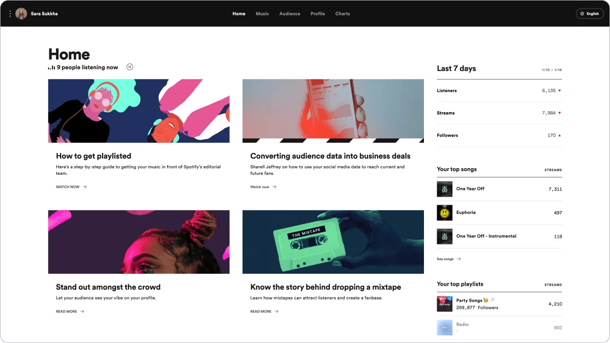
Sara: Spotify for Artists is a data and resource hub for artists who have released music onto Spotify. Upon launching Spotify for Artists you are brought to a dashboard that houses quick views of 7-day data trends (a view of who is currently listening) as well as a page full of resources. This view showcases pertinent data at a glance while also positioning Spotify as a resource and support hub for artists. In this main dashboard view, the user also sees how many people are listening in that current moment. This feature is a clever way to show dynamic data and to give the user a clear idea of how many fans are with them on a daily or hourly basis. More detailed information is organized under pages of Music, Audience, Profile, and Charts.
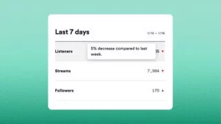
Sara: This product is evidently positioned towards the artists themselves as the data is reviewed using first-person language. Spotify uses simple and understandable terms to describe changes in growth (paired with simplistic triangle graphics to show growth and reduction), along with common verbiage to describe changes, such as “45% decrease compared to last week”. This aligns with Usability Heuristic #2: “Match between system and the real world”. This heuristic advises utilizing the users’ language, words, phrases, and conventions to help make information appear more natural and logical.
Sara: Data visualization can be a difficult task, yet I find that Spotify does an excellent job of keeping it simple and concise while still giving enough information – especially within the Audience page. They utilize simple bar charts to speak to categories and demographics, and the colour-coded legends quickly and easily depict the breakdowns within them. The way they tackle the map data is especially useful: the density of listeners is visualized by tonal range and paired with a hover function to show the breakdown by country. This feature makes it easy for the user to discover where their fans reside – very useful intel when deciding what tour stops may be most successful.
Sara: Spotify does a great job of ensuring that the platform maintains a high visual standard by providing image size specifications for profile and display images. They also continue to position themselves as a resource hub by providing advice and links to more tips to help artists make their pages look as professional as possible.
Sara: The primary flaw I found within Spotify for Artists was that there is very limited flexibility when looking at the timeline of data. The user is able to view data from the last 24 hours, 7 days, or 28 days, but the next option is “From 2015”. This lack of flexibility causes artists who have not been actively releasing music to have to view their timelines from a very zoomed-out view. This seems counterintuitive to the purpose of the product, which is to provide detailed insight into listener data.
Sara: Spotify utilizes shared networks to create efficiencies for their consumers. They allow an artist to connect several third-party accounts (Songkick, Sountbetter, Shopify, etc.) to their Spotify profile. This enables a fan to discover an artist, head to their Spotify profile to listen to their catalogue, view upcoming shows, or even buy a piece of merchandise without having to navigate outside of Spotify. Within the Spotify for Artists application, a user is also able to link the data from several artists which allows artist representation or management to easily manage several profiles on a roster at once.
Sara: I identified a Usability Heuristic violation relating to Heuristic #3: “User Control and Freedom”. The Charts page was recently added to the Spotify for Artists app which allows a user to view trending charts; however, a violation occurs as there is then no intuitive navigation to get back to the central dashboard. Clicking the Charts page launches a new URL that does not open in a new window, and there is no breadcrumb trail to navigate back. Clicking the back button is unsuccessful as it sends you into a loop of refreshing the Charts page. The only way a user can get back to Spotify for Artists is by re-entering the URL and re-entering login credentials.
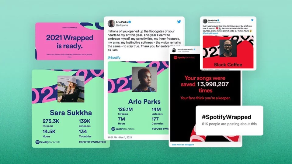
Sara: Spotify Wrapped is a genius feature that allows artists to generate viral marketing. Artists can view a report card that sums up the year’s action. Artists can push this out to their followers on social media to demonstrate data-driven growth and generate conversation. This gives artists a great opportunity to celebrate wins and it brings to mind the small daily wins that may have been forgotten throughout the year. It joins the artist and the consumer in a year-end review as fans get a sense of what their daily listens can do for an artist, and artists get a chance to see what else their listener base consumes.
Sara: I would remove the feature of “Compare to other artists” as I feel that in the current age of social media (and the negative effect it’s been proven to have, especially in younger demographics), this feature can only bring more harm than good. An artist’s journey is a personal one, and I believe that the focus of the product should only be to measure oneself against past history as a way to encourage artists – not to be influenced or discouraged by the strides or actions of others. Replacing this with a self-comparison of previous years would provide the same benefit of tracking growth and trajectory without introducing negative comparison.
Sara: “Source of streams” is a very interesting feature that allows you to see where a song is primarily being played from – Spotify Algorithmic, listeners’ playlists, users’ own playlists, etc. I believe there is room to incorporate the ability to compare multiple songs side-by-side to view where the listens are coming from. With the product’s current functionality, you can only view this data on an individual song page or by viewing the listening patterns of the catalogue from a bird’s eye view. With side-by-side comparison, a user could view user listening habits by genre and observe how a song makes its way into someone’s daily listening patterns.
Read our interview with Adam Cragg, Executive Director with New Ventures at Innovate Calgary, and learn how Innovate Calgary is helping to accelerate tech.
2021 was a big year of growth at Tiller. Read Chantelle Little's annual "Letter from the founder" to hear her take on Tiller's growth the past year.
Get our Founder & CEO's monthly insights on the ideas, challenges,
and shifts fueling growth-minded B2B SaaS marketing teams.


