


Read


New vision. New website. Same Tiller.
Tiller's new website just launched! This website represents a pivotal moment for Tiller. Learn more about why we did it and why it matters.
Dark mode has been around longer than you might think. In fact, the world’s first computers used dark mode by default because screen illuminating technology wasn’t efficient enough to light up an entire screen without burning out.
Today, dark mode user interface (UI) has become a common preference for web and app users alike, and dark theme design has become a popular design style, especially in the tech industry.
In this article, we’ll talk about the pros and cons of dark mode UI design and give you 7 helpful tips for creating effective design for dark mode.
Dark mode is a user interface (UI) design theme that displays light text on a black background instead of the traditional black text on white background. Both Google and Apple computers and mobile devices offer dark mode design settings which allow users to toggle between light and dark themes.
The rise of dark mode has also driven the demand for dark theme web design, which uses the same concept as dark mode display. These two concepts are often considered to be the same but simply put – dark mode utilizes a preset dark theme design throughout the device interface. Dark theme website design displays a dark background regardless of light or dark mode interface settings.
This design approach is popular for a few key reasons:
Let’s be honest. Dark mode UI design looks pretty epic. But there are also a few challenges that come with dark design territory:
When done well, dark theme design can captivate an audience. That’s what we want for your design. Here are six design tips to optimize your dark theme web design so it looks great and communicates your story effectively.
Dark backgrounds aren’t for every brand. So before you invest time and resources into crafting dark theme UI design, evaluate your brand story, brand character, and colour palette. Will a dark background help you tell your story more effectively? Will it help you highlight certain product features? Will it fit the context of your offering?
If the answers were no, a dark theme might not be for you. Otherwise – go for it!
Dark theme design doesn’t require a pure black background. In fact, dark grey can accomplish the same look and feel as pure black but can soften the contrast between text and background, making it easier for users to focus.
Dark grey backgrounds also enable you to use a wider range of colours in your design and achieve greater depth through shadows and elevation.
Saturation refers to the intensity of a colour. The more saturated a colour is, the purer it will appear. The less saturated it is, the more grey it will appear. Saturated colours look great on light backgrounds – e.g. a brilliant royal blue on a white background. But put that blue on a dark background and it can be difficult to read, causing the reader to strain to see it clearly.
Colour contrast is key in dark mode and dark theme design because your background needs to be dark enough that white text is easy to read. Contrast is defined as a ratio of one colour to another. Not enough contrast and your design will appear dark and muddled. Too much contrast and your lighter elements may appear to glow and deliver a jarring visual experience.
Just like dark backgrounds don’t have to be pure black, your white backgrounds don’t have to be Crest White Strips white. If whites are too bright, they can glow against a dark background and create a jarring visual experience for your user. Instead, soften any white backgrounds by using a slightly darker shade of white.
Colours evoke different emotions depending on their background. For example – a bright pink on a light background might feel light and playful. That same pink on a dark background might feel edgy and mysterious. Make sure your colour palette sends the right message to your audience.
Create a clear content hierarchy in your website design. On a light background, this is often achieved with shadows. But shadows aren’t as readily available in dark UI. Instead, highlight or illuminate different elements – the more illuminated something is, the closer the design element appears in the foreground.
We were tempted to self-inflate and just tell you to look at Tiller’s website to see a great dark theme design (you should definitely go look at it). Instead here’s a snapshot of why we chose to incorporate a mix of dark and light backgrounds in our own website design:
Now enough about us. Here are a few of our other favourite examples of dark themes.
If there was ever a web design to call sexy, it’s this one. Apple makes the Airpods Pro look like a million-dollar piece of art. We love how they start by showing the white headphones shadowed against a stark black background, and then bring them out of the shadows as you scroll down the page. The black screen also serves as a canvas for white text and vibrant visuals.
It’s a lengthy page to scroll through, but trust us – it’s worth it. When you hit about mid-page, Apple describes that the Airpods Pro are noise-canceling, then introduces the transparency feature by transitioning from a black background to white background, dramatically driving the point home.
This is Beyond is a next-level business event planning company dedicated to delivering inspiring, memorable experiences for businesses across the world.
We love how they mix dark UI with bright colours and large graphics. The dark canvas draws focus and attention to key pieces of copy, and they’ve layered subtle dust-like design elements onto the black for added interest. The dark background is contrasted with coloured backgrounds which gives the entire website a modern and energetic feel. And because these colours aren’t overly saturated, the text remains legible.
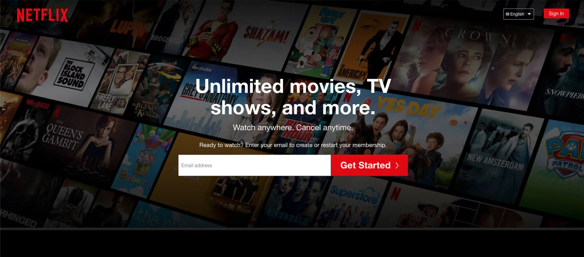
This might be one of the most common examples of great dark-themed UI, but it’s definitely worth mentioning. Netflix recreates the typical watching-TV-on-the-couch mood with their website design – dark, dim background and a bright, lit-up screen. This design provides users with a familiar experience that pairs perfectly with their brand.
When done well, dark theme web design can be stunning and incredibly effective at capturing your audience’s attention. But when done poorly, it can be distracting and difficult to engage with.
If you’re considering revamping your product or website with a dark UI theme, reach out. We’d love to discuss how we can help you elevate your brand through unique and stunning design.
Tiller's new website just launched! This website represents a pivotal moment for Tiller. Learn more about why we did it and why it matters.
What a year. Read Tiller's annual Letter from the Founder to see what we've learned in 2020 and how it's shaping our exciting future.
Get our Founder & CEO's monthly insights on the ideas, challenges,
and shifts fueling growth-minded B2B SaaS marketing teams.


