The best financial websites of 2020 & what you can learn from them

Where do you do your banking? Chances are you don’t physically set foot in your bank too often. Business Insider reported survey results indicating “89% of survey respondents said they use mobile banking. Further, a massive 97% of millennials indicated that they use mobile banking”.
What about insurance? There’s an app for that. Oh, and budgeting too. These days we can do nearly everything on financial websites, and visits to brick and mortar institutions are quickly becoming obsolete. We saw this more clearly than ever during the COVID-19 global pandemic. When money was deemed a high-risk for virus transmission the majority of financial institutions closed their doors. Why not? Service can continue remotely and via the website.
Online bank and financial websites have become second nature to most of us. But what makes for a great website? There are five key elements that, when executed well, can transform a website from functional to exceptional:
- Secure
- Responsive
- Intuitive
- Simple
- Informative
In this article, we’ll unpack each of these key elements and then evaluate some of the best financial websites of today. We’ll tell you what we love about them, and what we would change to make them even better.
Key elements of a successful finance website
Secure
This should really go without saying. Users must have full confidence in your company and its ability to keep their information secure. Your website is the face of your company and the portal through which customers send you their information. Make sure you use it to build trust.
Any website, no matter what industry you’re in, should be secured with an SSL certificate, meaning that the URL should read HTTPS, not HTTP. Beyond that, security practices like two-factor, email, and ID verification should all be standard on a financial website.
But trust isn’t just built through security features. Your financial website design can break or build trust in seconds. In fact, web design statistics show that visual appeal can be judged in 0.5 seconds. If a prospective customer doesn’t find your website appealing, they’re likely going to bounce to a competitor before ever reading the benefits your company can offer them.
What’s more, a Stanford University research study concluded that 75% of a website’s perceived credibility comes from website design. Users are unlikely to entrust their financial information to a poorly designed website. After all, if a company doesn’t invest in and care for their own assets, how will they care for someone else’s?
Responsive
Responsive web design optimizes the layout of a page for whatever device a user is browsing on, and it’s a must-have for any modern website. For financial websites this means a user should be able to use the full functionality of the website and access their important information from anywhere, on any device.
Intuitive
The modern web user has high expectations of a finance website. If a user doesn’t immediately understand how to log in or make a transfer, frustration can quickly set in. People expect to find what they’re looking for quickly and easily. There should be no time spent on guesswork on financial websites. Clear navigation, accessible customer support, and clear calls-to-action (e.g. Log In, Order Card, Open Account, Make a Transfer, etc.), all contribute to a smooth user journey throughout the site.
Simple
Finance is complicated. Your finance website shouldn’t be. Use clear, concise messaging throughout your website to help users quickly understand your services. Clean and simple design also makes it easier for users to focus on important information. Whenever possible, avoid creating text-heavy pages, and use plenty of white space.
Informative
As a financial organization, users expect you to be an expert in your field. Make sure your website reflects that. Be abundantly clear about what you offer and how it can help the user. They need to know the details about your services/product, how to use it, what it costs, and how safe their money will be.
Content marketing is also an invaluable marketing strategy. Offer the user valuable information – for free. Do you specialize in investment banking? Create blog content that details modern investment options or summarizes the latest reports. Content marketing has multiple benefits:
- Provides helpful information to the user
- Establishes credibility on subject matter
- Increases search engine visibility
- Creates sharing opportunities and increased brand visibility
Successful bank websites of 2020
Your banking website needs to grab users’ attention and immediately instill confidence and trust in your financial expertise. Here are a few of the best bank websites and our analyses of them.
1. Wealthsimple
Wealthsimple is an online investment management service that offers products and services for investing and saving.
What we love
Hands down, our favourite part of Wealthsimple is their clever and interactive animations. They use coin animations throughout the homepage which gives a cohesive experience. And we love the spinning coin triggered by scrolling. The transitions between animations are seamless.
There is plenty of white space that highlights their primary headline: “Get rich slow”. They take a simple and straightforward approach to their messaging which reflects the simplicity of their services. The design speaks to the fact that investing doesn’t have to be complicated.
What we would change
- The animations don’t work as well on mobile as desktop, so we would clean this up and ensure the experience is equally as powerful on all devices.
- While we like the clean look of the site, there is a lot of padding between content elements which at times makes the page feel empty. We would tighten up the design and create better balance with content.
2. Betterment
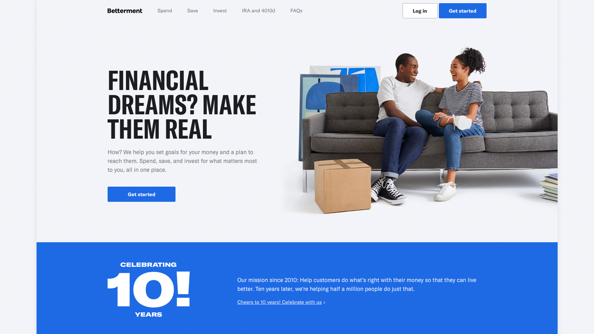
Betterment is an online investment company offering credit card, savings account, and investment services.
What we love
Betterment has a clean and modern design. They have ample white space on their homepage, well-balanced with content. Their value proposition is clear: “Spend, save, and invest for what matters most to you, all in one place”.
The primary navigation is also clear. They present the option to Spend, Save, or Invest, making it easy for first-time users to understand where to go for what they need.
There is a strong use of imagery on the homepage. Human photos are placed throughout the page and favoured over technical illustrations. But a mobile screen shows the Betterment app in action and helps users picture what to expect. This is a good balance and it gives the website a casual and accessible feel.
What we would change
- The homepage is too banded for our liking. We would introduce some directional design elements to help draw users’ eyes down the page and encourage them to scroll.
- Interestingly, Betterment’s site doesn’t fill the browser window on desktop – you can see the edges of the page. We would alter the design (and check responsiveness) and make sure the page fills the screen with a crisper, more professional appearance.
3. Ellevest
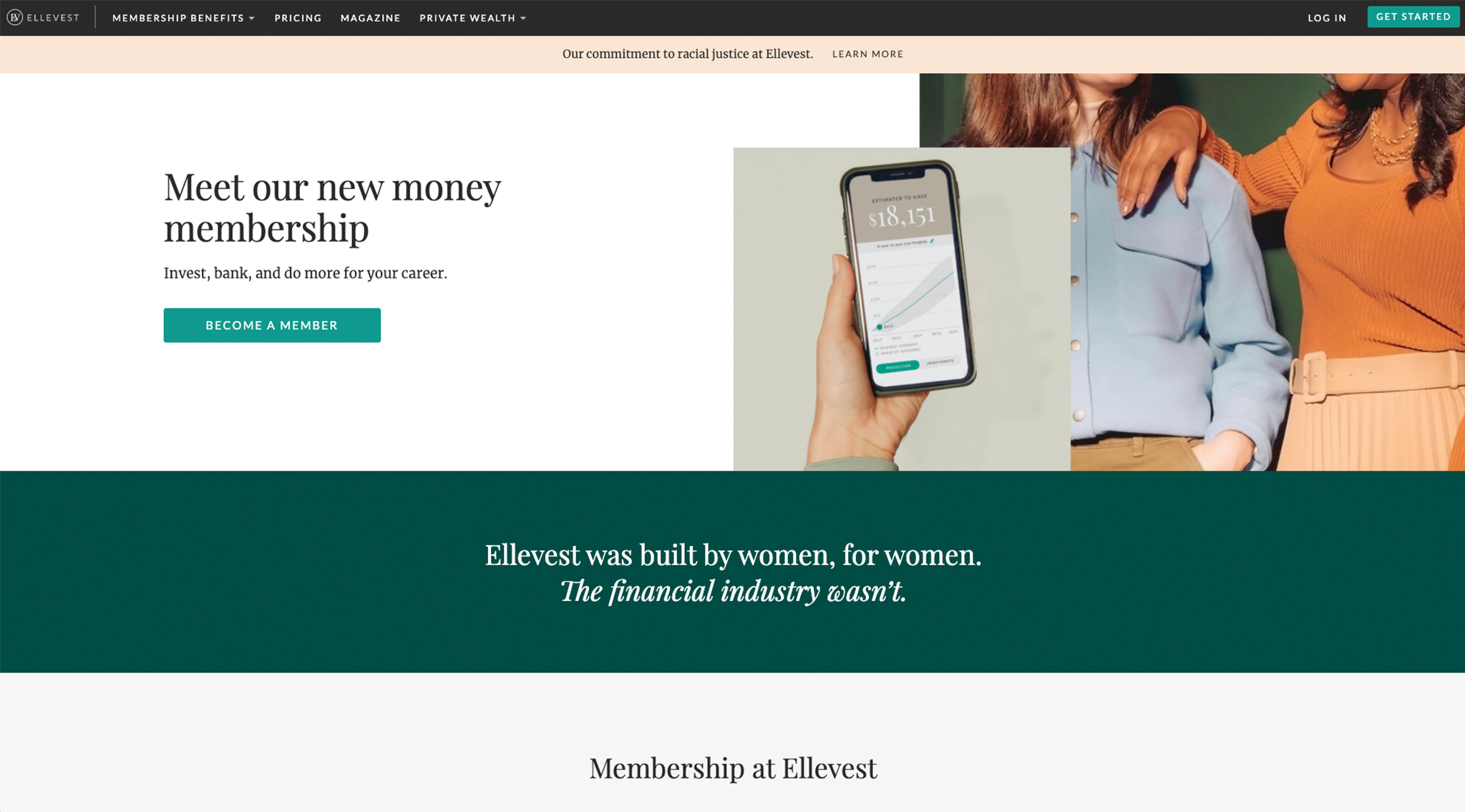
Ellevest is a personal finance company for females looking for services related to investing, banking, financial coaching, and retirement savings.
What we love
Ellevest has carved out an interesting niche by appealing to an exclusively female audience. A prominent band of copy on the homepage spells it out: “Ellevest was built by women, for women. The financial industry wasn’t”. A bold and intriguing statement.
Right away, female users are invited to experience a service created just for them, which in our opinion, is a clever and unique market strategy. They appeal to a niche market – but one that makes up (approximately) half of the global population.
The colour scheme is very nice – forest green and pale pink. It’s aesthetically pleasing, has a hint of a feminine flair, but also conveys the professionalism that’s expected on financial websites.
Overall, Ellevest’s website is clean and simple. It’s clear what they do and who they do it for. Their pricing is also incredibly clear with a large chart comparing cost and specs of the three membership options.
What we would change
- The design feels too simple on desktop. We contrasted this with the mobile experience and the same design elements feel more cohesive on a mobile screen. We would revisit the desktop design and fill it out a bit to bring it up to the quality on mobile.
- The font styles aren’t complimentary, particularly when there is a headline, subheading, and paragraph. We would evolve the fonts and find a better fit.
Successful electronic funds transfer (EFT) websites of 2020
Electronic funds transfer (EFT) companies have become essential to our cash-free lives. Here are the best EFT websites and our analyses of them.
4. Stripe
Stripe is an EFT company that is estimated to have 2.57% of market share. It allows businesses to do seamless financial transactions online.
What we love
Stripe has smooth animations throughout their website. For example, midway down the homepage there is a collection of animated use cases – credit card, Slack integration, eCommerce, debit machine, etc. Each of these has small animations and the animations rotate through the use cases. Had all of the animations happened at the same time the experience could have been too noisy.
Animated code lines illustrate Stripe’s API and appeal to the developer audience. As an agency offering web design and development services, we often integrate Stripe’s API into our client’s sites and can attest to the quality of this API.
The graphics are also very well-designed. We love the rounded edges that give a smooth, modern look.
What we would change
- Stripe doesn’t use a sticky header (we always recommend this for mobile) so you have to swipe back to the top of the page to navigate.
- The mobile menu itself is also quite crowded. We would move some of these links into the footer to make it easier for users to find what they need quickly without scanning through so many options.
- There are faint vertical grid lines on each page. These don’t appear to serve a specific design purpose and we find them distracting. We would remove these.
5. Square
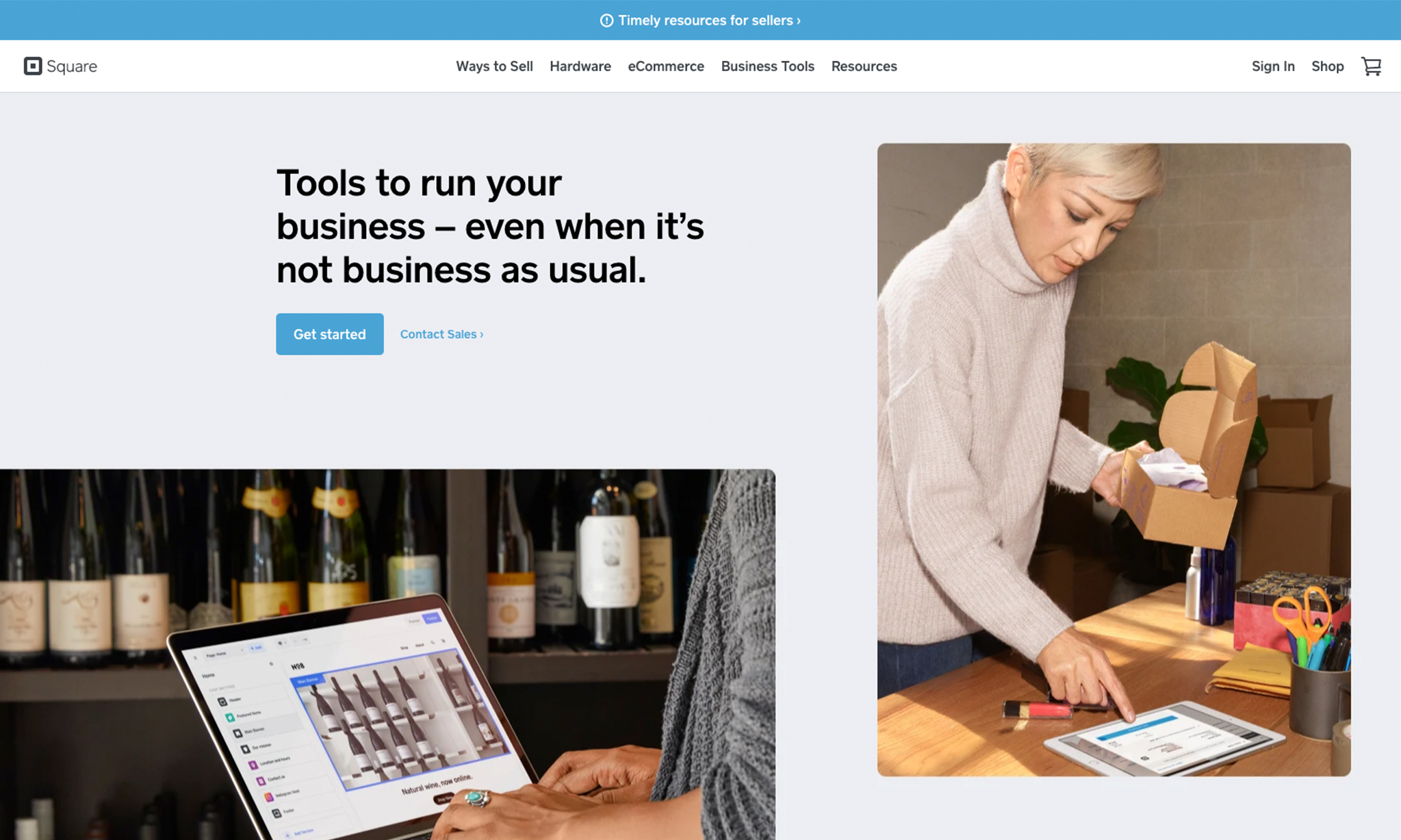
Square is an EFT company very similar to Stripe – they offer online payment options for businesses and specifically target eCommerce.
What we love
Square’s website is simple and straightforward. They use minimal copy in the first screenful of the page, opting instead for multiple images showing Square in action. We like the focus on helping users visualize themselves using the platform.
The copy is clear and concise, telling users exactly what they can use Square for. Headlines read “Reach more customers online” and “Offer delivery and pickup”. No cute phrasing, just cut-to-the-chase information. In our opinion this is an effective strategy for Square, given that prospective customers are searching for an efficient, stress-free solution.
While we don’t typically recommend that our clients use image carousels, we don’t mind how Square does it. They use a carousel to highlight various features, but it’s designed to showcase one feature brightly lit, while the features on either side are slightly shadowed. This helps draw our attention to the fact that there is more to see and encourages us to click through.
What we would change
- Square uses a lot of grey. We would brighten up the colour palette to make it feel more modern.
- The icons and images lack interest. We love creating unique visual content and feel we could add more life to the site with custom iconography.
Does your financial website need a revamp?
Does your website instill confidence and trust in its visitors? Do users immediately understand the products or services you offer?
We are steadily transitioning into a cash-free, digital finance world. So if your financial website design isn’t confidently leading the charge, it’s time for you to consider a revamp. An expert agency like Tiller can work with you to create a high-quality financial website that has the potential to attract a global audience and establish your brand as a front-runner in the market.


