A full guide to responsive web design


Remember when browsing the web meant using dial-up internet on a desktop monitor the size of your microwave? Now we use desktops, laptops, tablets, tablets that look like laptops, smartphones, and smartphones that look like tablets. We own any number of these devices and expect to have satisfying web experiences on each of them. Especially on mobile.
In fact, approximately 50% of current internet traffic comes from mobile, and web design statistics predict that by 2025, that number will increase to nearly 75%. There are serious implications for businesses still running websites that are not optimized for the majority of their traffic.
To be successful in the market, your website should be accessible by any device. How? Responsive web design.
What is responsive web design?
It’s a simple concept, but one that delivers huge impact. At a high level, responsive web design is a method that optimizes page layout, no matter which device a user is using to browse. Specific coding strategies direct websites to scale, rearrange, or hide content depending on the device that is accessing it.
The term first entered the history of web design in 2010 when web designer Ethan Marcotte published an article titled, “Responsive Web Design”. Marcotte stated:
“Rather than tailoring disconnected designs to each of an ever-increasing number of web devices, we can treat them as facets of the same experience. We can design for an optimal viewing experience, but embed standards-based technologies into our designs to make them not only more flexible, but more adaptive to the media that renders them. In short, we need to practice responsive web design.”
Marcotte was proposing a flexible design solution. Prior to responsive web design services, businesses could satisfy mobile users by creating a second version of their website, specifically designed for mobile. These websites were identified by a distinct URL. For instance, the mobile version of “tiller.tillerstaging.com” would have been “m.tiller.tillerstaging.com”. But this approach had its flaws:
- It was inefficient for the user. Page load times were long as the browser had to determine which website version to load. Plus, the design was often quite different from the desktop version, which had negative effects on brand consistency.
- It was time-consuming for businesses. It required the creation and management of two separate websites.
- The mobile version didn’t account for all of the other devices a user might want to use to access the website. Devices with “in-between” screen sizes were left to display awkwardly disproportionate designs.
Now, ten years after Ethan Marcotte’s revolutionary article, responsive web designs have become the industry standard. Think of your favourite website. If you can easily locate important content on your desktop and mobile device without having to zoom in or scroll horizontally to find what you’re looking for, and if your experience feels just as good on your tablet as on your laptop, you’re likely experiencing a site built with responsive web design.
The key to responsive web design is design thinking – a solutions-based approach that aims to predict and meet the needs of the people the design is for. Design thinking requires asking questions like:
- How can I make it easy for the user to navigate the website with either a touchscreen or a cursor?
- What is the most important content for the user to see on a smaller screen?
- Will the menu be easy to find and intuitive to use on various devices of various sizes?
These questions (and many more like these) can help direct the technical application of responsive web design.
Responsive web design FAQ
Before we dive into the technical side, let’s address a few common questions related to responsive web design.
What is the difference between responsive and adaptive web design?
Although the two are sometimes confused, they are two distinctly different approaches. Let’s take a deeper look at responsive design first.
Responsive web design uses precise CSS (Cascading Style Sheets) media queries to apply a specific layout to a certain size of viewport (the area of the screen that displays information). Think of it as an “if/then” statement (the type used for scientific hypotheses). If you have a viewport of 600 pixels or smaller, then query X should be applied.
Though the layout changes, the content remains proportionate to the size of the viewport via collapsing columns, stacking images, hiding content, etc. These are all achieved with fluid layouts and flexible media, which will be discussed shortly.
Adaptive web design displays layouts that have been specifically designed for common screen widths. Each layout is static, meaning that content actually changes. For example, a desktop version uses a large background photo, but it doesn’t suit a smaller screen. The design for the smaller screen might use a solid background instead. Different layouts for different sizes. This approach requires more work on the front end but can be a good choice for businesses with a good understanding of the devices their audience uses.
At Tiller, we typically recommend choosing responsive web design, as it delivers a consistent user experience, independent of screen size. That helps build brand consistency and equity in the market.
What is mobile-first design?
Mobile-first design is a design principle that dictates designers create for mobile devices first, before desktop or any other device. It requires designers to identify the most important content right from the start – the content that mobile users absolutely need in order to engage and take the actions necessary for the desired outcome. That design is then gradually built out for larger devices. Mobile-first design typically results in more efficient, precise, and practical designs.
Is mobile-friendly the same as responsive?
No – although it is a common misconception that they’re the same. The key difference is that a mobile-friendly website uses static content that is the exact same on any device, whereas a responsive website uses a flexible layout that changes based on the screen size.
For example, a responsive website might display a full menu on desktop, but transition to a hamburger menu on mobile. Since a mobile-friendly website doesn’t change based on the device, it would be best to opt for a simple menu that won’t appear too crowded on a mobile device.
It might sound counterintuitive because of the name, but mobile-friendly website design is best for websites with fewer mobile users. There are limitations on mobile-friendly design because it must be effective on small and large devices.
If you expect a large volume of your users to access your website from their mobile devices, responsive web design is a better choice. You’ll have the flexibility to create a user experience that is customized for the mobile user.
What is the difference between a fluid layout and a fixed layout?
A fluid layout uses relative measurements that respond to the width of the viewport (screen size). Measurements are determined as percentages of the max width of the viewport, meaning that as the screen size changes, the percentage of the max width remains the same.
Conversely, fixed layouts use static measurements that don’t respond to the width of the viewport. So if you were to view a website on a desktop and slowly shrink the browser window, the design wouldn’t change. You would need to use horizontal scroll to view all of the content.
Fixed layouts are generally only used when creating a website for a very specific device. But given the mobile internet usage statistics, most new websites use fluid layouts to deliver great user experiences across the variety of devices.
What is the difference between responsive web design and progressive web apps?
This is actually a trick question. A progressive web app (PWA) is an application that is built on and lives on the web. But it uses responsive web design methods. Forbes, Uber, Starbucks, and Pinterest, are just a few examples of well-known brands that employ PWAs.
A PWA has similar features to a native app (the kind you download on your phone), but there is no need to install or download it. It can work on any device, any browser (although some features may not be available with outdated versions). PWAs are fast and reliable and, thanks to service worker scripts, can offer engaging features like push notifications, camera access, and location services – features traditionally only available in native apps.
According to Google, who coined the term “progressive web app” in 2015, “One of the nice aspects of the “progressive” nature to this model is that features can be gradually unlocked as browser vendors ship better support for them”. So the capabilities of PWAs are ever-increasing.
How do you know if a progressive web app is for you? Well, it all depends on the functionality your business needs. If you want to deliver an app experience to your users, without creating a full-blown mobile app, a progressive web app may be the right choice.
Is responsive web design really necessary?
Yes. Responsive web designs optimize layouts and deliver seamless user experiences. In today’s device-saturated market, websites that don’t deliver exceptional design, when and where the user wants it, have higher bounce rates and miss opportunities to convert prospects into customers. Responsive web design is also more cost-efficient and easier to manage, as you only need to create and manage one website. This alone should be a huge motivator for most businesses to embrace responsive web design.
But wait, there’s more. Google actually favours responsive websites. It can detect responsive and mobile friendly sites and actually index them faster, because it only has to index one version (rather than separate desktop and mobile versions). Plus, Google will recognize when a website delivers a poor user experience, and then rank it accordingly.
And web statistics reveal that beginning September 2020, Google will begin mobile-first indexing all websites. This means that your website will first be evaluated on its performance on mobile devices, then desktop. After September, non-responsive websites will be fighting an uphill battle in the market.
In its March 2020 article discussing mobile-first indexing, Google stated:
“While we continue to support various ways of making mobile websites, we recommend responsive web design for new websites. We suggest not using separate mobile URLs (often called “m-dot”) because of issues and confusion we’ve seen over the years, both from search engines and users.”
Can I update my existing website to make it responsive?
Yes. Design and development updates can usually be made to your existing website without having to start from scratch. But just like home renovations, the extent and degree of difficulty will determine the time and cost associated required to optimize for responsiveness. It all depends on the quality and content of the existing designs and code.
A site audit by an experienced agency offering web design and development services can determine what would be required to make your website responsive.
Components of responsive web design
Now that we know what responsive web design is, it’s time to take a closer look at the various components developers use to optimize user experience on various devices. This is a basic overview, as the actual coding can become quite complex depending on the nature of the website.
1. Viewport
The viewport is the area on a screen that displays information. Each device has a specific sized viewport. A responsive website uses a meta viewport tag within the code to tell the browser how to control dimensions and scaling. The tag essentially ensures that the width of the page corresponds to the width of the device.
Without the meta viewport tag, mobile design would show up on only a small portion of a desktop screen. Or vice-versa – a desktop design would be oversized on mobile and require horizontal scrolling to see all content.
2. Flexible layout
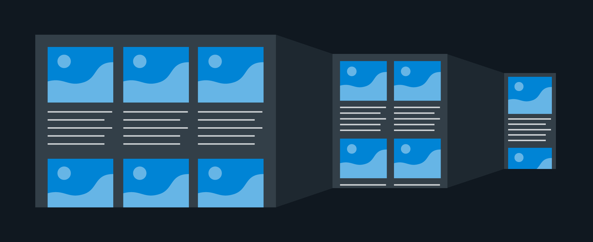
There are so many different dimensions on devices. So you can’t rely on one specific viewport setting. CSS allows you to code the layout using flexible grids defined with percentages instead of pixels. These maintain content spacing as the viewport changes.
For example, if you have three text columns, a flexible grid layout can direct the columns to collapse down to two or one as the viewport shrinks. Similarly, content blocks or images can realign vertically rather than horizontally. These strategies are important for two reasons: to ensure key content is visible and hierarchically aligned, and to maintain appropriate design ratios of content to white space.
Flexible layouts are also used to strategically hide content. Deciding what, if any, content should be hidden requires design thinking – what content is key to the user experience? One common example is to hide the main navigation and replace it with a hamburger menu. This is a reasonable choice, as the majority of mobile users recognize the hamburger menu, and a full menu can take up valuable real estate on a small screen.
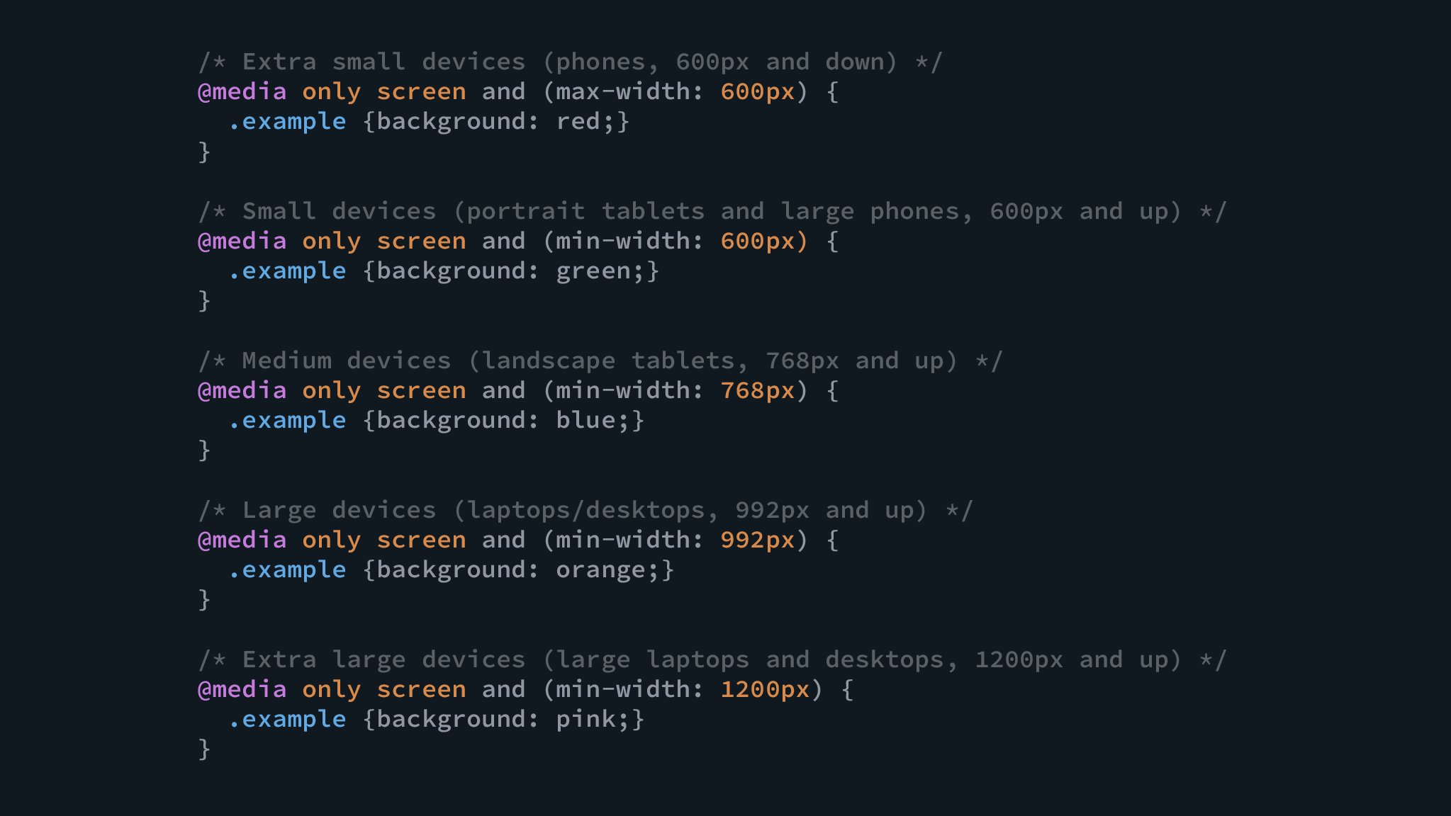
3. Media queries
A media query is a precise snippet of code that applies the appropriate design styles for various devices. It is essentially an if/then statement. If the viewport is X size, then apply X layout.
Media queries enable extensive changes to the layout for different viewports. Here are just a few of the conditions that can be used in media queries:
- Dimensions – the height and width of the device’s viewport
- Orientation – landscape or portrait (typically used for tablet)
- Aspect ratio – the width-height ratio of the viewport
- Hovering – the capability to hover over any elements (only relevant with cursor, not touchscreen)
- Resolution – the pixel density of the device
These conditions (and many more), can be used independently or combined to create very precise instructions. And a corresponding layout is only applied if all of the specified conditions are met.
4. Typography
Readability should be adjusted for various device sizes and layouts. Font size is an obvious consideration, but there are also other factors that contribute to creating easily digestible content.
Let’s first understand how people read and take in content. We don’t read every word. We scan. And various studies have demonstrated that people scan pages in an F-shaped pattern. We start more slowly with the first few lines, and then jump between and along lines searching for words that provide us with the overall meaning of the content.
With this in mind, page layout should always be conducive to scanning. Large blocks of text should be broken into shorter paragraphs and measure (line length) optimized. Measure is generally recommended to be 45-75 characters long (including spacing), and responsive web design allows us to maintain an optimal measure on various sized screens. The measure helps to inform breakpoints, where text columns can be expanded on collapsed depending on the size of the screen.
Regarding size, desktop design should display larger fonts that can be comfortably read from an arms-width away. Mobile fonts should be smaller, since users will naturally hold the device closer to their face. Font size should be such that horizontal scrolling or zooming is unnecessary.
5. Flexible images
Images must be able to shift position and scale with the flexible grid. This can be achieved by assigning images a maximum width of 100%. So even when the viewport changes, the image must stay within the maximum width of the screen. As the viewport shrinks, the image shrinks.
It’s also important to compress images for smaller screens to optimize load times.
6. Breakpoints
A breakpoint is a set point where the layout must adjust (e.g. two text columns collapse into one).
These are typically determined by the most common device sizes, so it’s important to stay up to date with what’s available in the market. But beyond that, a design thinking approach should be used to determine when the design should shift to ensure aesthetics and content hierarchy are maintained.
Content size still changes before and after a breakpoint (because of flexible layouts that adapt as the viewport changes). The key is that the layout itself only shifts when that breakpoint is hit. Two different media queries are used before and after each breakpoint that direct how content is displayed.
For example, if the device is 600 pixels or larger, X layout should be applied. But if the device is less than 600 pixels, Y layout should be applied. You can identify the breakpoints of any responsive website yourself by gradually shrinking the browser window on your desktop.
7. Evaluation
Once the code is complete, the website’s responsiveness should be evaluated. Testing the design at various viewports and before and after each breakpoint is a key part of quality assurance (QA) testing.
At Tiller we test designs on actual devices (desktop, tablet, Android, iPhone), to see how the design looks and feels in real life. We compare between devices to ensure the designs are displayed exactly how we intended, and make sure that the navigation is intuitive. We’ll often have several team members involved in testing to get more than one set of eyes on it, as each user will interact with a website differently. In addition to device testing, we use Chrome DevTools and CrossBrowserTesting to confirm that code and design are accurate at all viewport sizes, especially those that fall in between our device sizes.
Brilliant responsive web design examples
It’s becoming increasingly rare that a website is not built for responsive web design. But simply having a responsive website doesn’t guarantee it will be effective at helping your business reach its goals. It takes the right pairing of design and development to create an effective and visually stunning web experience for all devices.
We’ve selected three of our favourite responsive websites to show you responsive web design in action. And to see a few of the responsive websites Tiller has designed, check out our website design case study collection.
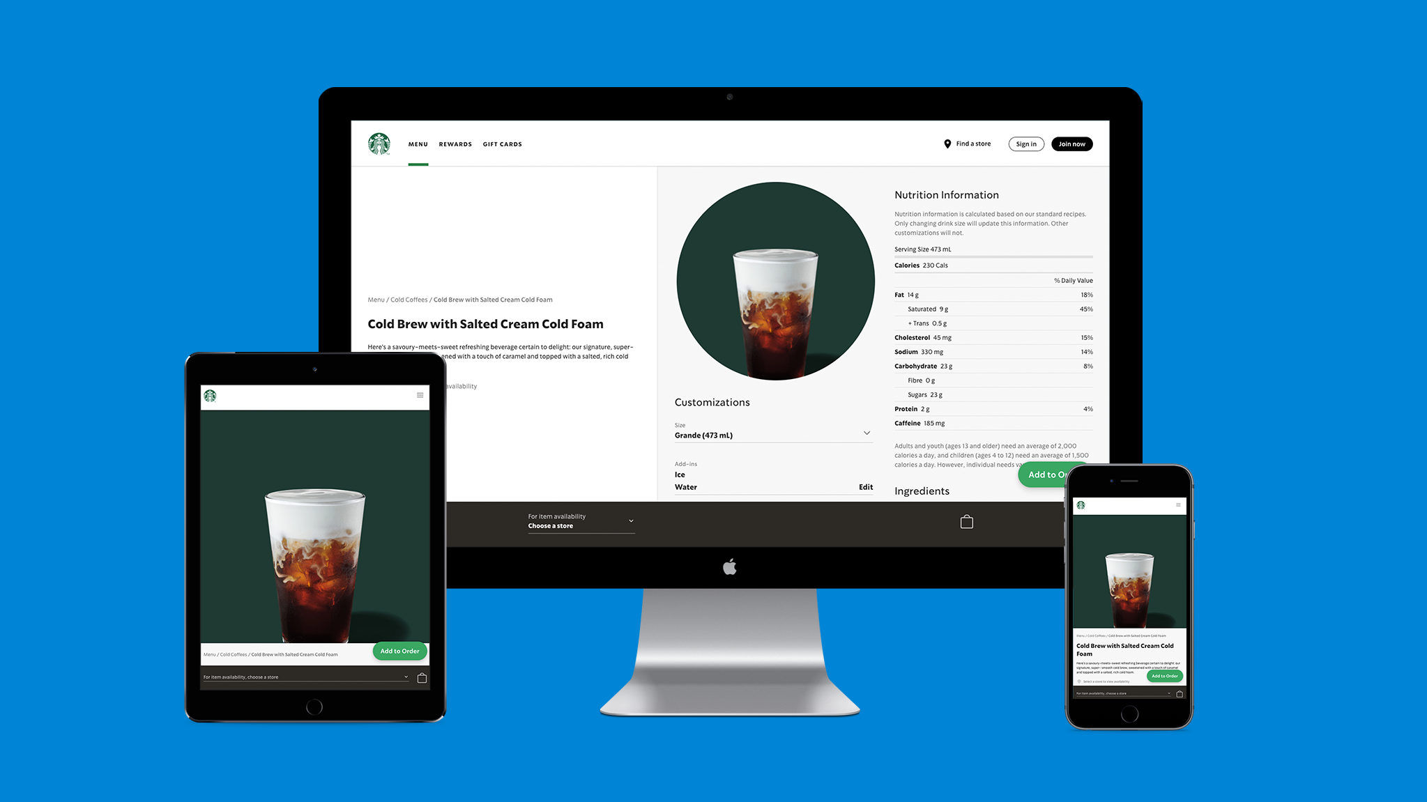
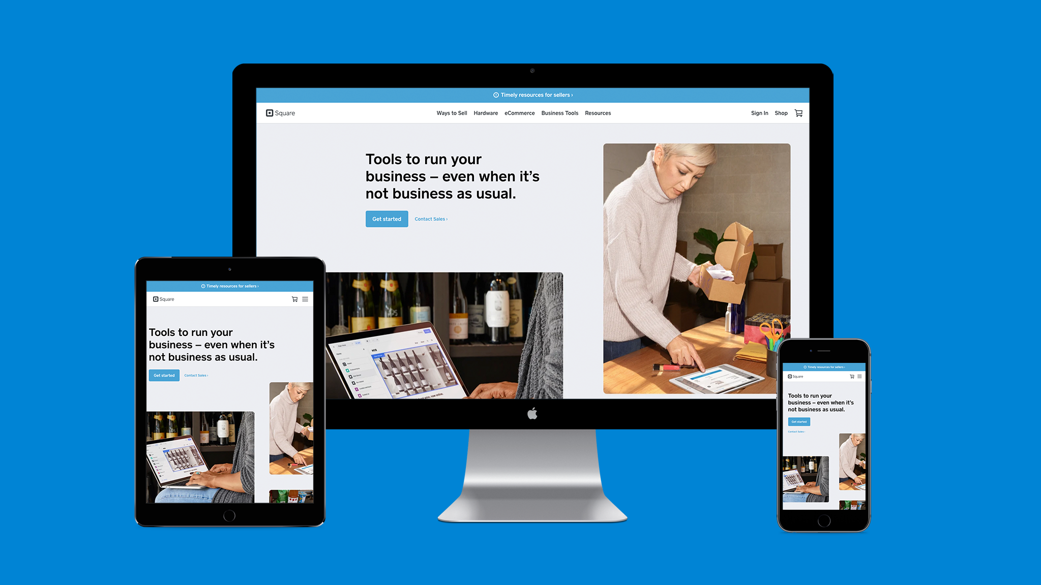
Square
As a B2B SaaS (business-to-business software as a service) mobile payment company, it’s imperative for Square to have best-in-class responsive design. They have a clean, simple layout with plenty of whitespace that’s consistent on desktop and mobile.
Square is an excellent example of fluid layouts. If you slowly shrink your browser window on desktop, you’ll see the content blocks begin to stack at each breakpoint.
We also like that Square opted for a carousel on mobile, but fully visible content on desktop. The carousel highlights a variety of tools that you can swipe horizontally to see. Mobile users are attuned to cues to swipe because it’s intuitive to touchscreen. But carousels are a bit riskier on desktop. Users could easily miss a cue to click through the carousel and miss out on valuable content.
Finally, the sticky CTA (call to action) button at the bottom of Square’s mobile design ensures that users always know how to get started.
Wealthsimple
Wealthsimple is a B2C (business-to-consumer) robo-advisor financial tool. They use a variety of fast, engaging animations in both desktop and mobile, and as we slowly shrunk the browser window on desktop we noticed seamless transitions.
The animations are triggered by scrolling, so we compared the experience of scrolling with a mouse on desktop, to touchscreen scroll on mobile. The experiences were equally satisfying, especially the spinning coin animation at the bottom of the homepage.
The experience on mobile is essentially the same as on desktop, with minimal changes to content. Instead of hiding content on mobile, it is neatly collapsed into a single vertical column.

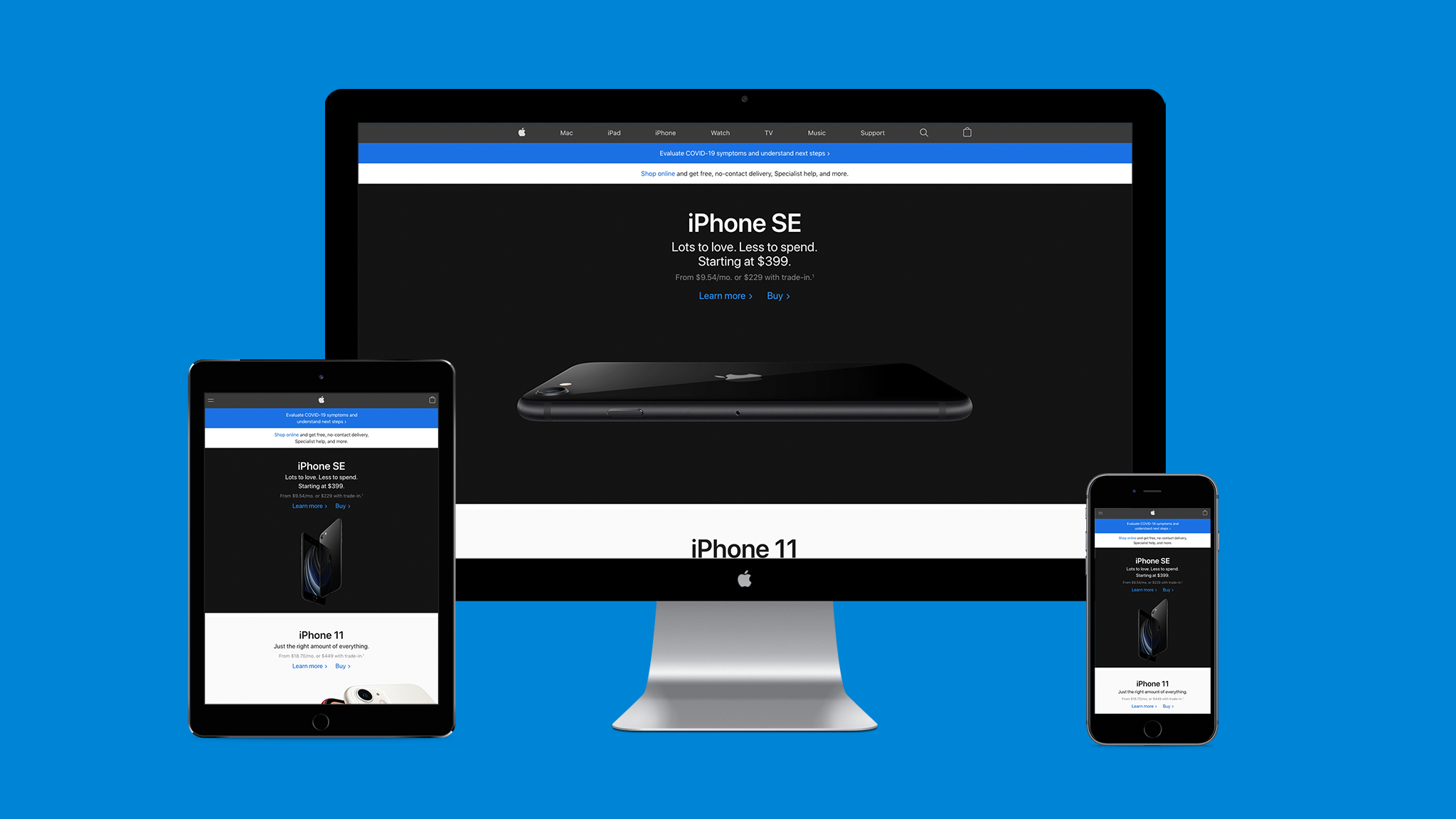
Apple
Apple now uses seamless responsive design, but that wasn’t always the case. Interestingly, they were actually slow to adopt the method, because they had traditionally designed for their own specific devices. It wasn’t until the release of the iPhone 5 in 2012, that Apple joined the responsive movement – two years after Ethan Marcotte’s debut of responsive web design. A 2014 article details this transition:
“With iOS 6, and the subsequent release of the taller iPhone 5, Apple introduced something called Auto Layout—a relationship-based layout engine. Unlike the iPad, which required a separate build, apps for the taller iPhone were the same build with layout adjustments applied. Auto Layout was Apple’s first true foray into responsive design within native applications since, much like the web, different layout rules were applied to the same base code.”
But now Apple is on board with responsive web design. To see what would stand out to us on their website, we first loaded the homepage on desktop. Then slowly decreased the browser window. Although most content stayed the same on smaller windows, we noticed that the primary image (a large horizontal iPhone) was subbed out for a smaller image of two vertical iPhones. This smaller image was also present on mobile. In our opinion, this was a smart choice as the latter image was better proportioned for smaller screens.
4 takeaways when considering responsive web design for your website
The way we surf the web has changed again and again, and new devices are introduced into the market all the time. Your website must be able to keep up and engage prospective customers whether they’re sitting at their desk at home or browsing their phone on a walk.
Staying current in the market requires making continuous improvements to your website. And if while reading this guide to responsive web design you’ve realized your website is not responsive, well, we hope you’ll seriously consider optimizing.
Remember these key takeaways:
- Mobile devices are becoming the dominant device for internet usage
- Google will soon be mobile-first indexing
- Always design with the user experience in mind
- Responsive web design is always evolving; routinely optimize
At Tiller, we design exceptional, responsive web experiences that engage prospects and convert them into customers.


